Widget Summarizer- Listening
Updated
The Widget Summarizer is a one-click AI+ feature that generates key insights from a widget, providing summarized, actionable information alongside the data visualization. This eliminates the need for multiple drilldowns, allowing you to access high-level insights quickly. By pinning these summaries next to the widget, you can focus on the most relevant information, making it especially useful for quick, digestible insights.
Access Widget Summarizer
Access to this feature is controlled by the AI + Dynamic Property. To enable this feature in your environment, contact your Success Manager. Alternatively, you can submit a request at tickets@sprinklr.com.
Let's look at the navigation steps:
Go to + New > Sprinklr Insights > Listening Dashboard (In the Learn Column under Custom).
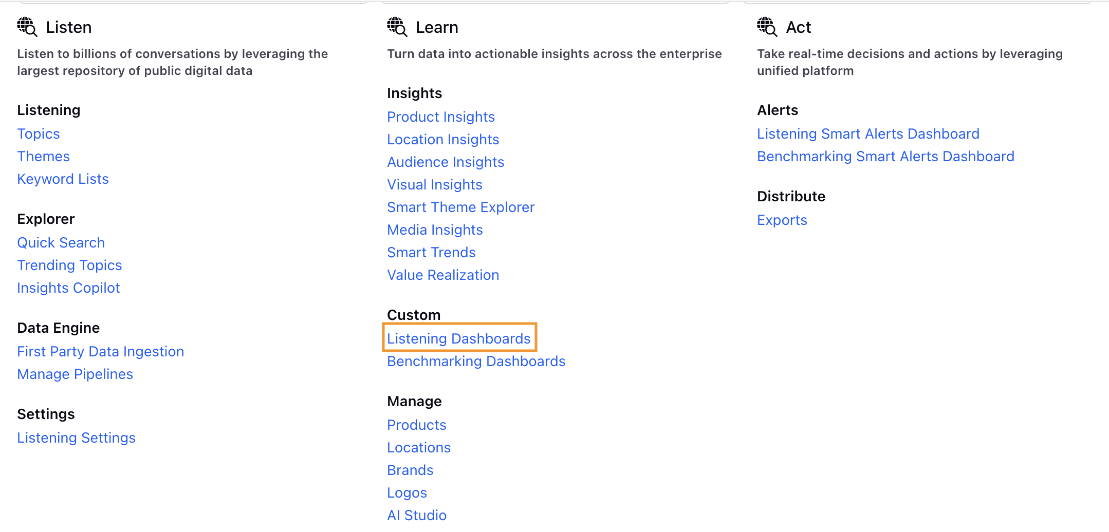
Click Listening Dashboard.
Open a Dashboard on the Listening Dashboard Record Manager. If the Dashboard is inside a folder, open the folder and then open the Dashboard.
Click Generate Summary button towards the top right of the Widget. There will be a loading message that will appear. The widget summarizer will render a streaming response.


The flicker keeps rotating till the entire content gets streamed.

 Note: The Widget Summarizer is currently supported on 9 visualizations:
 Pie Chart, Column Chart, Stacked Bar, Stacked Column, Line Chart, Spline Chart, Area Spline, and Area.
Once the Summary is generated, you will have the option to Copy the summary.
Click Pin Summary to pin the summary to that particular widget.
Example: If your widget is initially set to 30%, clicking Pin Summary will expand the widget to 100%.

On Summary, you can perform the following activities:
Refetch button: Whenever the summary is stale, click the refetch button to generate a new summary.
A stale summary will appear if you apply additional filters, update any metric or dimension, or change the chart type that differs from the original setup. If the summary is outdated, you can click the Refetch button to regenerate it with the updated filters.
Timestamp: Tells the time when that particular summary was generated.

Summary Details: Click Summary Details option to check the filters used at the time of summary generation. It will give us the configuration of the widget at the time of summary generation. You will get this option on pinned summary.
Like: Click Like button to express satisfaction.
Dislike: Click the Dislike button to express dissatisfaction with the summary and provide feedback. You can choose from the available feedback options or add your own custom comment. You have the ability to select the reason for dislike from the predefined feedback options or you can feel free to add specific details aswell.
 Note: You can now view more up-to-date AI-generated widget summaries for pinned widgets on externally shared dashboards, even if you do not have direct access to Sprinklr. Eligible dashboards can be refreshed twice in a week and external dashboard links support limited summary refreshes, helping you access the latest insights with minimal effort.
Action Plan: Allows you to associate the insight to an action plan. You can associate the entity to either a new Action Plan or an existing one. The scenarios are explained below:
Clicking "Create a New Action Plan" will launch the Action Plan creation screen, with the relevant entity already linked.
If you click on the “Add to Existing Action Plan” option, a search bar will become available, enabling you to locate an existing action plan and connect the entity to it.
Once the Insights copilot response entity gets associated to an action plan, there will be some metadata that gets added automatically:
Dashboard Name
Filters applied on the Dashboard
There will be a static visual snapshot of the Insights Copilot response entity that can be easily copied, and this snapshot will remain unchanged even if the underlying insight is updated. Because we attach fixed snapshots to Action Plans, the data will always appear exactly as it did at the time of association.
Note: The Copilot response uses the dashboard’s filters when generating insights, but these filters are not stored with each response. Because filters are dynamic, any changes made after the response is generated will appear as the updated filters. As a result, Action Plans display the current dashboard filters rather than the ones originally used to create the response.
Translate: Widget summary will always be generated in the user's platform language. The user will also have the option to change the language from the UI using the translate option. Example: If the user's platform language is English, the user can change the language to Arabic.
 Note: This option is transient and not permanent, which means if the user leaves the screen or refreshes the dashboard, the language will change back to the user platform language again.
Emojis: Sentiment for each category is visually represented with an emoji, showing positive, negative, or neutral sentiment for each summary point.
Mentions: When you click on the Mentions option, all the sampled mentions used to generate the summary are displayed.

Manage Widget Summarizer
External Link
You have the ability to generate widget summary in a live external link for Non-Sprinklr users to also have access to the dashboard.

In order to create external link follow these steps:
Click Options Menu( 3 dots )at the dashboard level.
Click Get External Link.
Here, you can select the Date Range and specify an expiry date. Additionally, you have the option to enable several features, including making the external link password protected, hiding PII data, toggling the auto-sync feature, adding a rolling time range, and enabling SSO (Single Sign-On).
You can copy the link and share with external users.
Export Option
You can now export the widget summary in PPT, PDF, and PNG formats by clicking on the Export Widget option from the Options menu (three dots) at the widget level.
