Combination widget
Updated
A Combination Chart is a widget that combines two or more charts to display multiple sets of data in a single chart. This chart type is useful when you want to show different kinds of information in a single chart.
For example, you can combine a column chart and a line chart to display numerical data and a trendline. The column chart might show the number of Distinct Users for each country, while the line chart shows the mentions trend. This combination of charts lets you see each country's total Users and Volume trend of mentions.

The Combination Chart widget maintains the same scale for Y-Axis across multiple metrics and hence can be used to compare and benchmark different metrics data on the same scale. If you want to add different scales for different metrics, you can plot the Dual Axis Dual Metrics widget for the use case.
Use cases
The Combination widget will help Research Analysts, Social Media Marketers and Campaign Managers who want to
Track engagement metrics such as Likes, Comments and Shares Count on a single graph.
Track the trend of sentiment around a post or campaign by plotting a number of Positive, Negative, and Neutral Mentions.
Visualize campaign engagement from different countries by plotting the Country, total number of Mentions, and Distinct Users from each country engaging with it.
To add a Combination widget
To plot the Combination widget, you can use any existing editable dashboard or create a new one. Refer to this article to learn how to set up a Custom Dashboard.
Once you have the dashboard where you want to add the visualization widget, follow the steps below –
On the custom dashboard, click Add Widget in the top right corner.

On the widget builder, enter the widget's name and select Listening as Data Source.
Select Combination as a visualization type for your Listening widget.
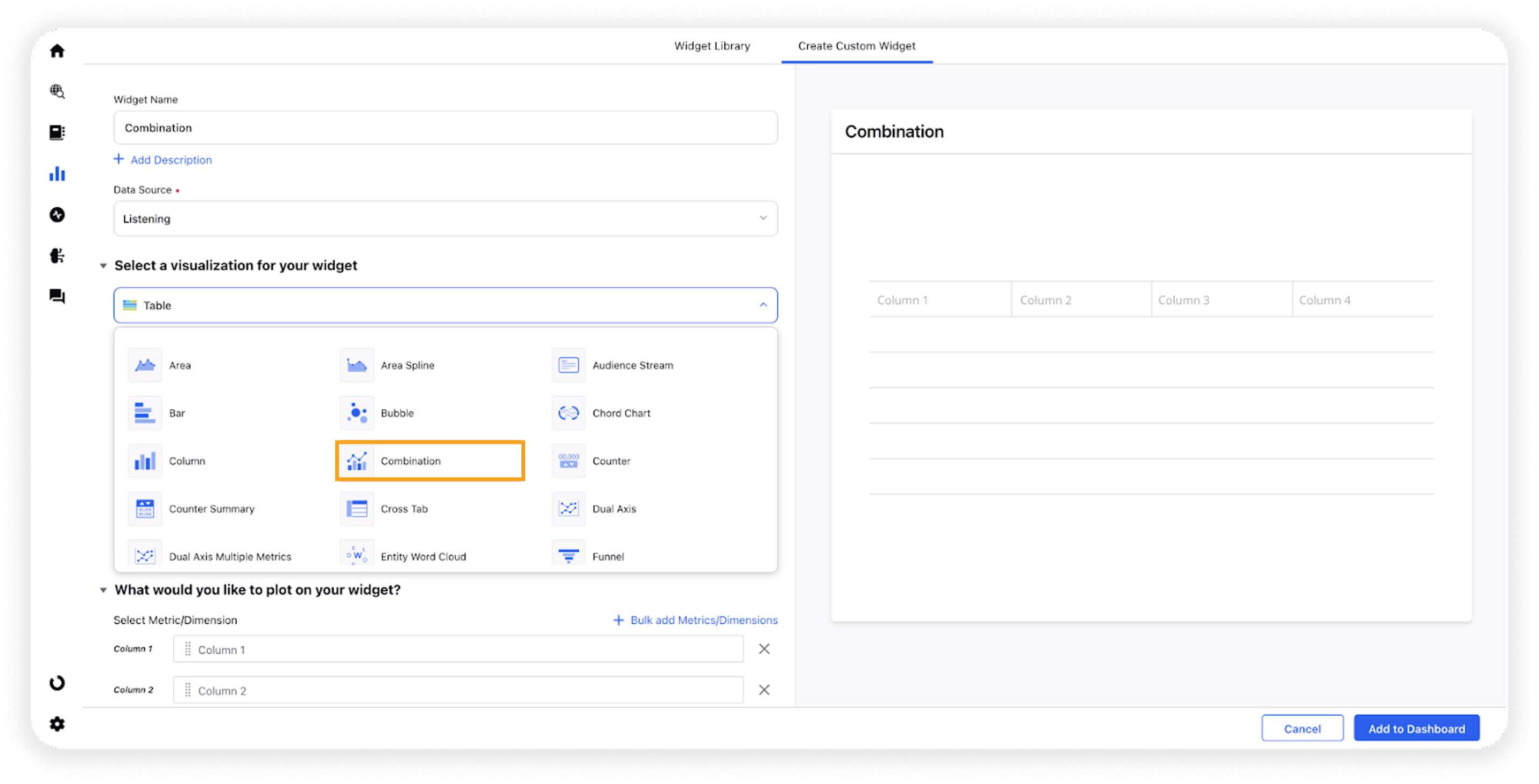
Under the What would you like to plot on your widget section, you will be given the below fields –
X-Axis: Plot any dimension in X-Axis e.g. Created Time
Y-Axis (Y1 and Y2): Plot desired metrics to see a combination of charts. You can choose the chart type from the following options –

Line
Column
Spline
Area
Area Spline
Note: You can add more metrics to visualize them on the same widget in a series view.
Select the configuration options as desired. For more information, refer to the – Configuration options section below.
Under the Defined Advanced Options section, you can apply filters, define additional properties and set personalized targets with these options.
Click Add to Dashboard in the bottom right corner to create your new widget.
Configuration options
The configuration options available for the Quadrant Matrix widget will work as follows –
Configuration Option | Action |
Do you want to Label Axis? | If you want to add names for your Axis, you can select this configuration option, and then you can enter the desired names as labels. |
Include Data Labels | Selecting this option will include the data labels on the Combination widget. |
Hide Legend | Selecting this option will hide all the legends on the widget. |
Start Y-Axis from Zero | Selecting this option will start the Y-Axis (vertical axis) widget from zero (0). |
Include Data points with no value | Selecting this option will include the data points with no value. |
Define Y/X-Axis Scale | You can define the Min & Max of X-Axis and Y-Axis bounds. Also, you can adjust the step size of the X-Axis and Y-Axis to get the best-optimized visualization. For more information, refer to Define Y-axis scale in Widgets. |
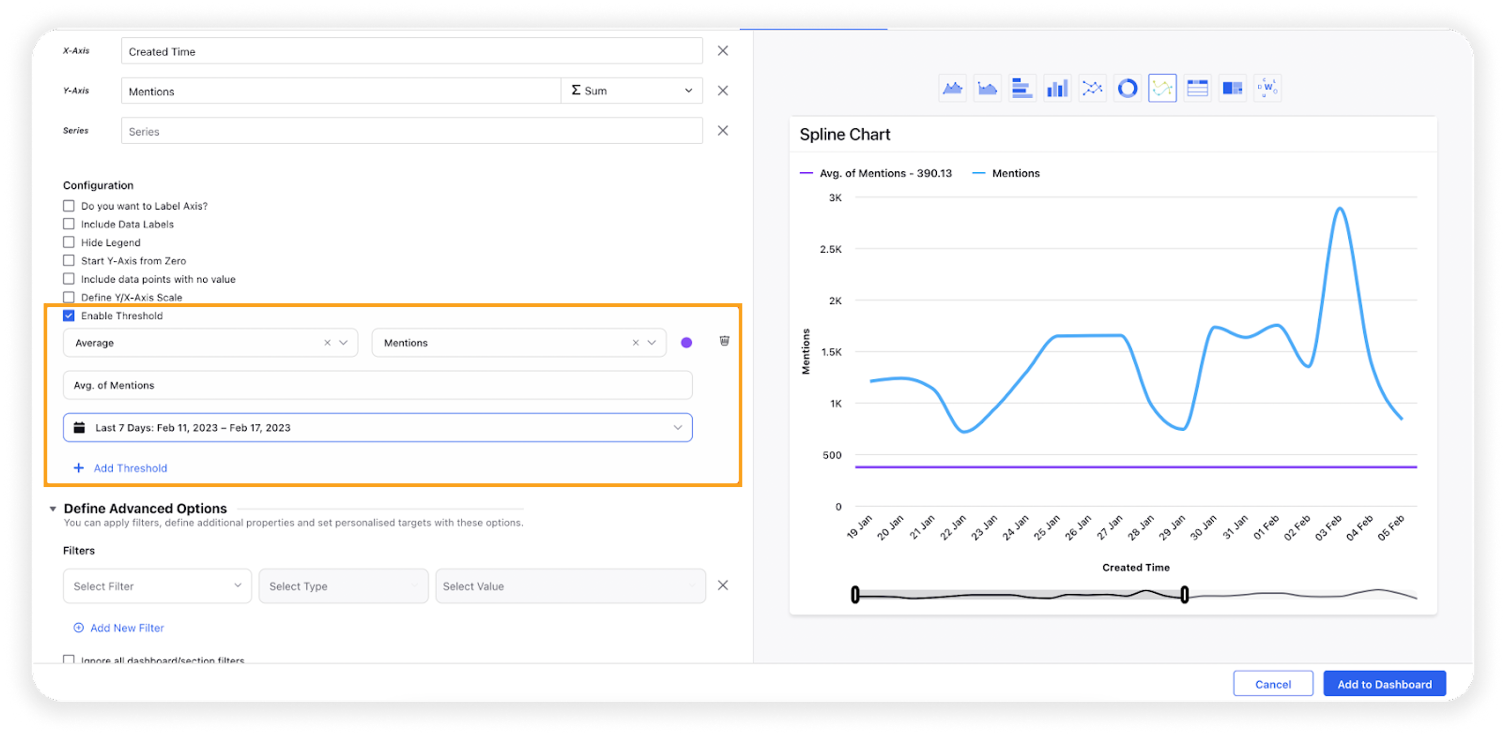
Enable Threshold | You can define a custom threshold to benchmark the overall data with it.
|