Story Card widget
Updated
Sprinklr helps you to identify and stay on top of crisis events happening around your brands, competitors, campaigns, etc. by clubbing similar articles together to form a story. The Story Card Widget plots various stories in the form of Story Cards.
Rather than going through every published article to understand which events are moving toward a crisis, the Story Card widget does all the work quickly to give you the events that matter. Sprinklr’s advanced AI algorithms group similar-looking news articles and social, TV, and Print messages together to form a story.
Note: The Story Card widget will be available in all reporting dashboards if MM&A is enabled in your environment. Please work with your success manager to enable this widget visualization.
Use cases
Track key stories/crisis events revolving around the brand, product, executives, or campaigns, allowing PR analysts to identify the events that matter quickly.
To strategize how to drive the narrative for your organization, stories allow PR managers to identify the impact of different stories.
Identify channels to prioritize proactive communication by measuring the spread of an event across editorial channels like news and Print and compare it against that of social channels.
To add a Story Card widget
To plot the Story Card widget, you can use any existing editable dashboard or create a new one. Refer to this article to learn how to set up a custom dashboard.
Once you have the dashboard where you want to add the visualization widget, follow the steps below –
On the custom dashboard, click Add Widget in the top right corner.

On the widget builder, enter the widget's name.
Select Story Card as a visualization type for your widget.
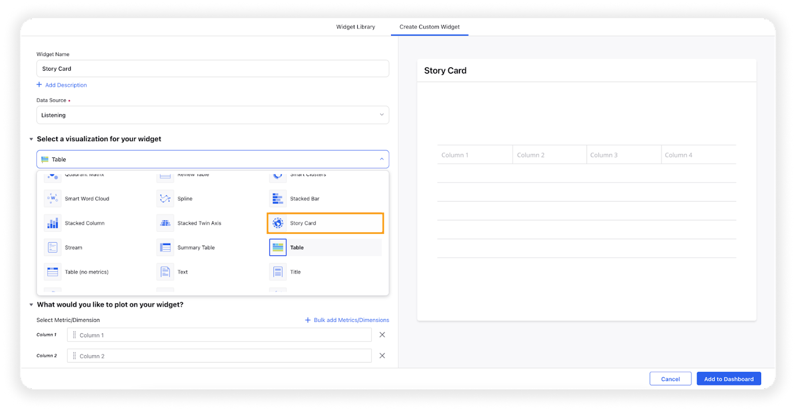
Under the What would you like to plot on your widget section, dimension Active Story and metric Mentions will be prefilled. You can add any other metric as well which will be shown at the bottom of each story card.
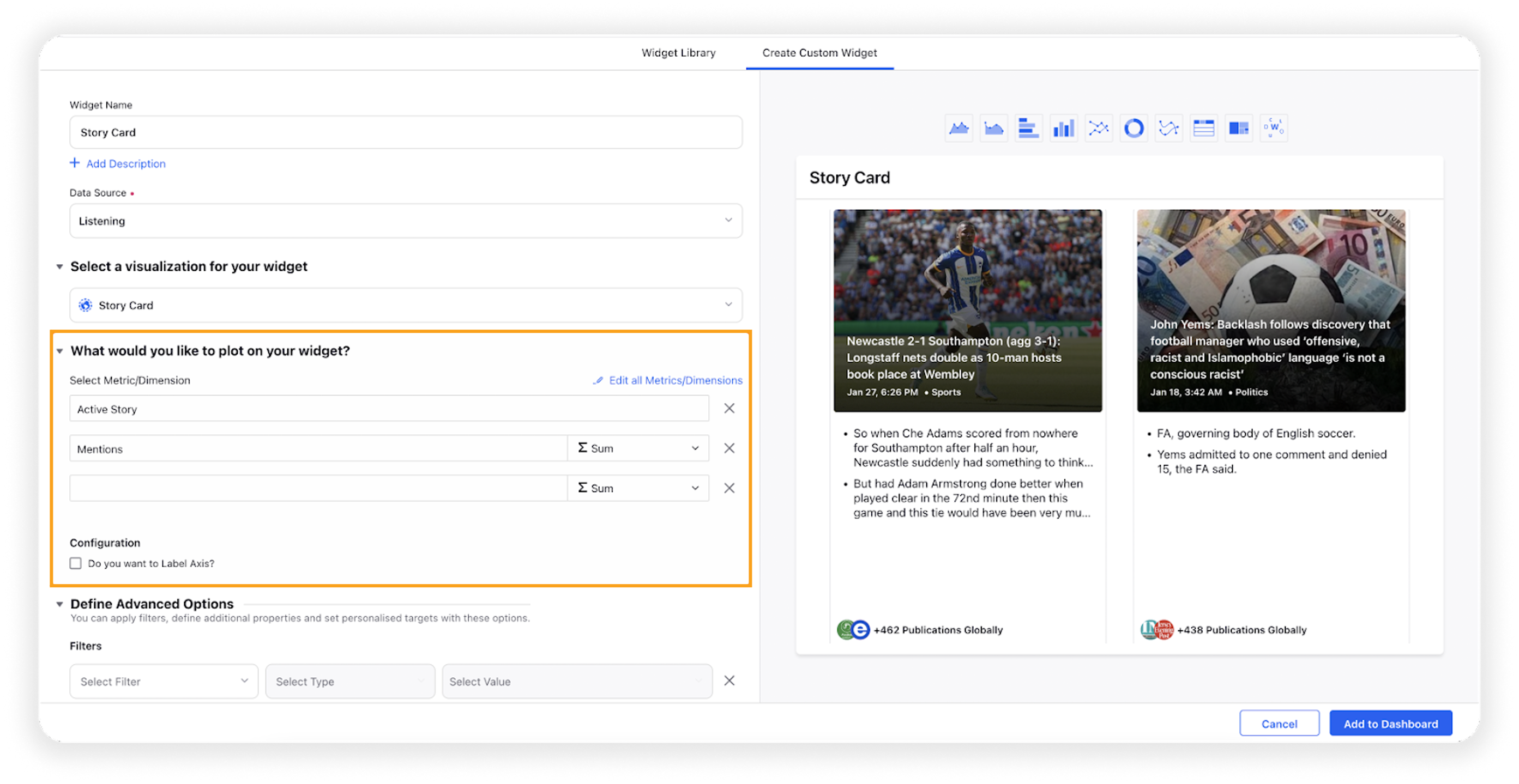
Select the configuration options as desired.
Configuration Option
Action
Do you want to Label Axis?
If you want to add names for your Axis, you can select this configuration option, and then you can enter the desired names as labels.
Under the Defined Advanced Options section, you can apply filters, define additional properties and set personalized targets with these options.
Click Add to Dashboard on the bottom right corner to create your new widget.
Different components of the Story Card widget

#1 – Cover Image and Title
The cover image and headline of the story card are derived from the article which emerged first in the story. The image and title get updated when an article with a higher MOZ rank is added to the story. If the primary article does not contain any image, a default image is provided by Sprinklr.
#2 – Date-Time and Category
The date and time at which the story was created. The date and time in the story card is determined by the timezone selected in the date range filter. The default timezone is according to the user’s country.
The category represents the field about which the story talks, for example, Technology, Health, Education, etc. These are assigned using AI news categorization models that identify the category based on the title and content of the primary article.
#3 – Summary
Based on the significance scores derived using a proprietary algorithm, the top 2 sentences related to the title are selected for a summary.
#4 – Publication Count
The count represents the number of publications of articles or messages covering the story. This count gets updated when an article from a new publication gets mapped to the story.
#5 – Selected Metric
Users can select the metrics as per their requirements for reporting purposes. For example, Mentions, Earned Engagement, and Distinct Users are plotted as metrics.
Grouping of articles under a particular story
The title and content of a news article are the two main entities that decide the story to which an article will be added. Thus, for every article entering the Sprinklr database, the title and content of the article are analyzed using our advanced AI algorithms, which are then, either –
matched to an existing story with a similar title and content, or
a new story is generated, with that article being the primary article of the story
By default, the first article mapped to the story is selected as the primary article. The primary article of the story gets updated based on the MOZ Rank. If an article with a greater MOZ Rank than the primary article is added to the story, the new article is crowned as the primary article. The image, title, and summary of the story are also updated according to this new primary article.
For creating a story, apart from messages from online news and blogs, TV, print, and tweets from verified profiles are also considered. Any shares of the news article on social channels such as Twitter, Facebook public pages, and Reddit (i.e. if a tweet/post contains a news article URL) are also grouped under the same story.
What is the lifetime of a story?
The lifetime of a story is 4 days. Incoming messages are not added to the story if the corresponding story has been created before 4 days. We have this criterion to ensure that the stories are relevant and up to date. Any similar message published after 4 days generates a new story. This is also why users might also see similar stories because the story creation times of both stories are more than a week apart.
However, the social shares count has been tracked for 15 days since the article was added to the story. Finally, the social shares of the story will be the combined shares of all the news articles attached to that story.
Determining the title and the summary of the story
Out of all the articles grouped under a story, the article with the highest MOZ Rank, i.e. highest popularity is selected as the primary article. The image, headline, and summary are derived from it.
The story's title would be the same as the headline of the primary article. Note that the article's title is based on the title available on the online website or print media.
The summary of the story is derived as follows –
The entire content of the selected news article is broken into sentences and meaningful phrases. Then, each sentence/phrase is given a rank based on its importance using a proprietary algorithm. Now, based on the significance scores, the top 2 sentences that are related to the title are selected for summary.