Widget Configuration-Social Analytics
Updated
Reporting in Sprinklr Service, using Social Analytics as a data source, pulls data from a variety of social media platforms, customer service channels, and digital touchpoints where brands engage with customers. Within the Reporting feature, you can customize, expand, and dive deeper into metrics by creating tailored dashboards and widgets.
Sprinklr’s dashboard creation process and widget library streamline report generation, making it faster and easier than ever. You no longer need to memorize countless metrics across different channels. Instead, metrics and dimensions are grouped into categories, allowing you to quickly identify and access the most relevant ones for your reports.
Create Reporting Widget
Prerequisites for creating Widgets:
Create permission under the Dashboard section in the Reporting module.
Existing Reporting Dashboard and access to it.
Follow these steps to create a Reporting Widget:
Go to Care Reporting in the Analyze column on the Launchpad. This will open the Reporting Dashboards Record Manager.
Open the Dashboard on the Record Manager, where the Widget must be created. If the Dashboard is inside a folder, open the folder and open the Dashboard.
Click the Add Widget button at the top right of the page to open the Widget Builder page.
Enter the following details regarding the Widget:
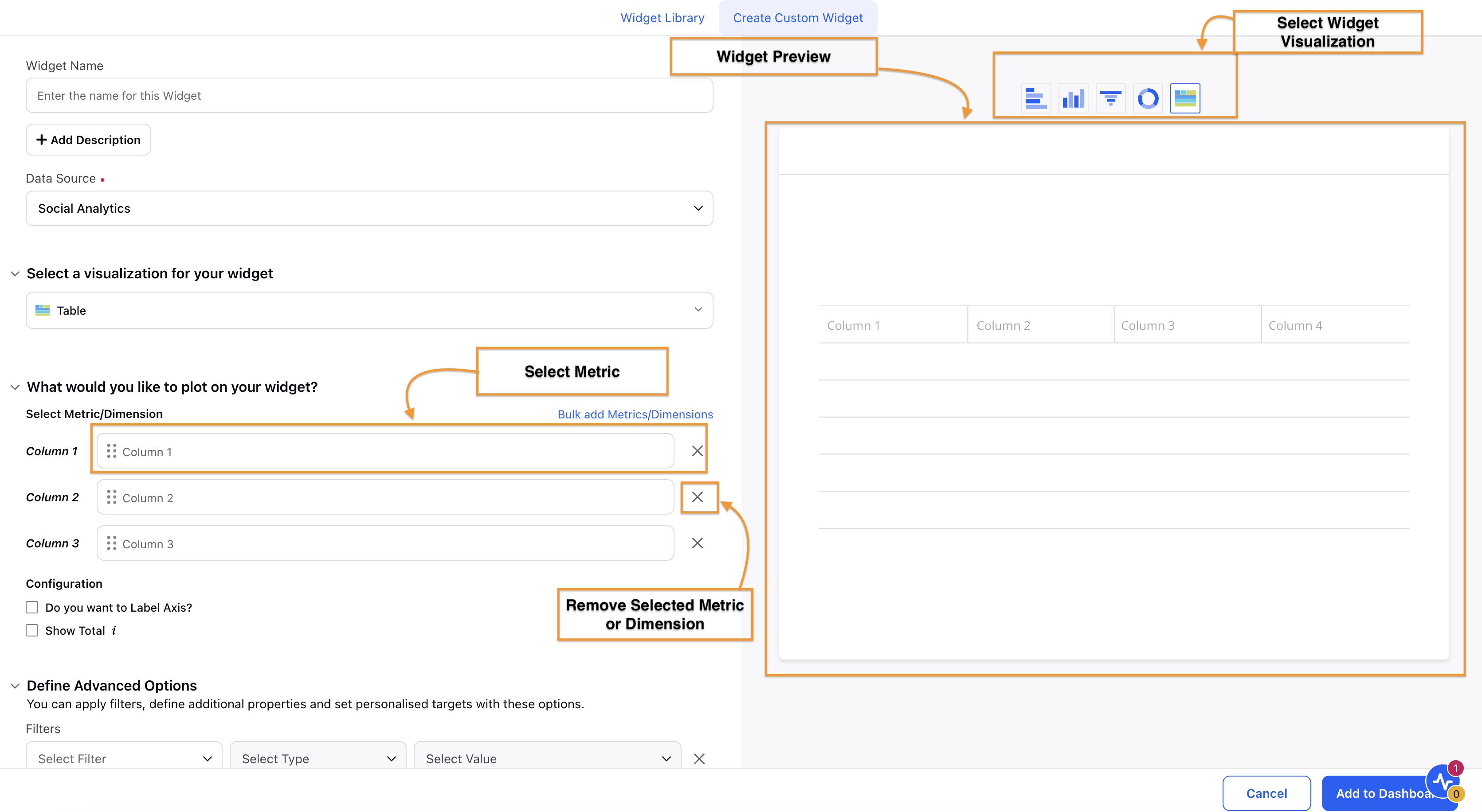
Widget Name: Enter the name of the Widget for identification.
Add Description: Click this button to display a field where you can briefly describe the Widget’s purpose and functionality. This description will be visible when you hover over the “?” sign on the Widget in the Dashboard.
Add Tutorial: Click this button to attach a tutorial video using the Media Uploader. This tutorial video will be visible when you hover over the “?” sign on the Widget in the Dashboard.

Data Source: Select Social Analytics as data source.
Select the visualization you want to use from the list in the Select a visualization for your widget section. Table, Pie, Spline, and Bubble are some of the available visualization options. Explore available visualizations.
Select the Metric(s) and Dimension(s) to be plotted in the What would you like to plot on your widget? section. Click the Bulk add Metrics/Dimensions option to select multiple compatible Metrics and Dimensions. Refer to the Selecting Metrics and Dimensions section below for further details.
Select the appropriate Configuration options for the visualization.
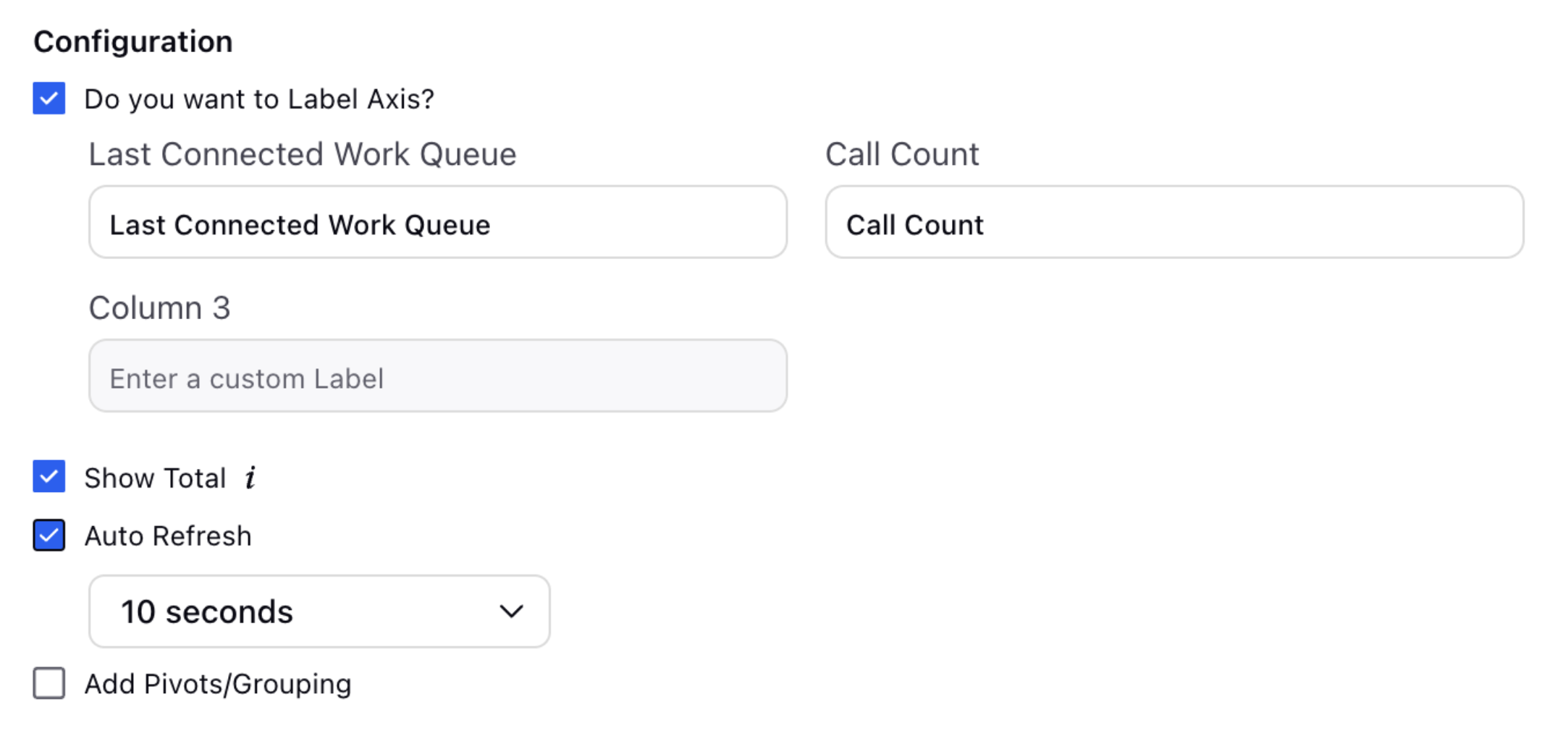
In the Define Advanced Options section, you can select Filters, define additional properties, modify display options, and more.
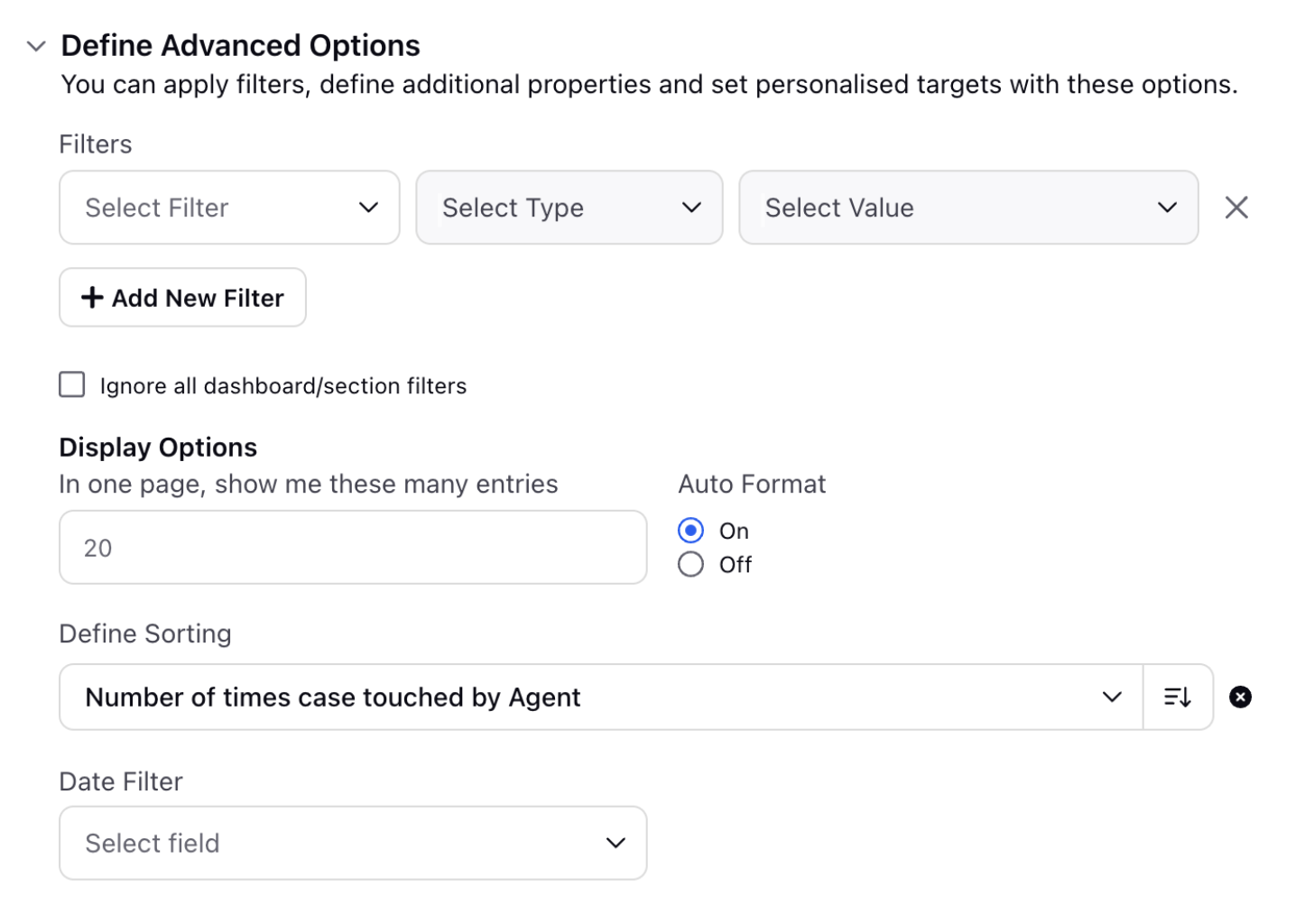
Applying Filters
Select Filter: Choose the type of filter you want to apply. It determines the category or attribute of the data that will be filtered.
Select Type: Select the operator to define how the filter will be applied to the value. The available operators are:
Containing: Shows records where the specified field includes the given value.
Not Containing: Shows records where the specified field does not include the given value.
Exists: Shows records where the specified field is present and has a value.
Select Value: Enter the value(s) that will be checked against the selected filter type using the chosen operator. The value(s) entered here will be used to match records based on the criteria defined by the filter type and operator.
Click the Add New Filter button to add more Filters.
Select the Ignore all dashboard/section filters checkbox if you want the selected Filter(s) to override any existing Dashboard-level or Section-level Filters.
Bulk Copy Paste
The Bulk Copy-Paste feature enables you to select multiple values simultaneously by using Copy paste vertical cells from excel OR a comma-separated format rather than inputting them individually. This functionality greatly reduces time consumption, particularly when dealing with extensive lists of values.
Applicability
Supported Dimensions: You should be able to copy and paste multiple values into filter fields in both standard dimensions and custom fields, across all data sources and reports, provided the field type is either Single Select or Multi Select. Let us have a look at the criteria:
Standard Dimensions: Compatible with certain standard measurements (DP Based).
Custom Dimensions: You will need to activate a DP specifying the custom field id for which the functionality is needed (type must be single select or multi select) will begin to support bulk copy-paste functionality across all reports.
Paste Limit: You can copy and paste up to 100 values at once. If you exceed this limit, you will encounter an error.
Example: If its less than 100 and use cases is more than 100 then we will have to copy paste multiple times.
Incorrect Value Handling: In the event of improper value handling, we receive an error message. You can click the View Error button to see the list of values that do not match. This error will disappear in 10 seconds if no action is taken.
How does it work?
You can now copy values from external sources, such as Excel and paste them directly into filter fields for faster and more efficient filtering. The feature supports two input formats:
Line-separated values (e.g., values from Excel rows)
Comma-separated values
(e.g.,
)
If both formats are used together, the system will treat commas and line breaks as valid delimiters, allowing for flexible input. However, spaces are not considered delimiters, so entries must be properly formatted to ensure accurate filtering.
b. Display Options
Enter the number of entries to be visualized on a page.
Auto Format: Auto Format determines the number of decimal points for data visualization. When Auto Format is enabled, data is displayed with 2 decimal points (1.23, 0.24, 4.02, and so forth). Turning Off Auto Format allows you to choose the number of decimal points, ranging from 0 to 5. Selecting 0 decimal points will display data as whole numbers (2,6, 45, 49, and so on).
Define Sorting: This field allows you to choose how to sort the data in the visualization. To sort the data, select the Dimension or Metric for sorting, then choose Ascending or Descending order. Ascending order will display the lowest value of the selected metric or dimension at the top while Descending order will show the highest value at the top.
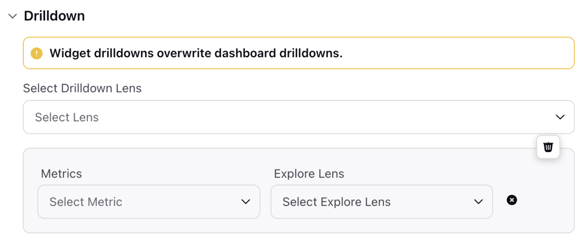
The Drilldown section allows you to get further analytics on the Metrics used in the Widget. Select a Drilldown Lens in the Select Drilldown Lens field. Additionally, click the +Metric Drilldown button to a Metric for the Drilldown in the Metrics field and then select the appropriate Drilldown Lens in the Explore Lens field.
Click the Add to Dashboard button at the bottom right of the page to create and add this Widget to the Dashboard.
Note: This new widget UX view will be visible wherever Service Analytics DP is enabled. In locations where DP is not enabled, the old view will remain as is.
Selecting Metrics and Dimensions
You can access the Metrics and Dimensions by clicking on the Select Metric and Dimension Window. On the left side of the window, you will find Report Groups containing the respective Reports along with favourites and recently used Metrics and Dimensions. You also have the option to search the report group by typing the name in the Seach Bar.
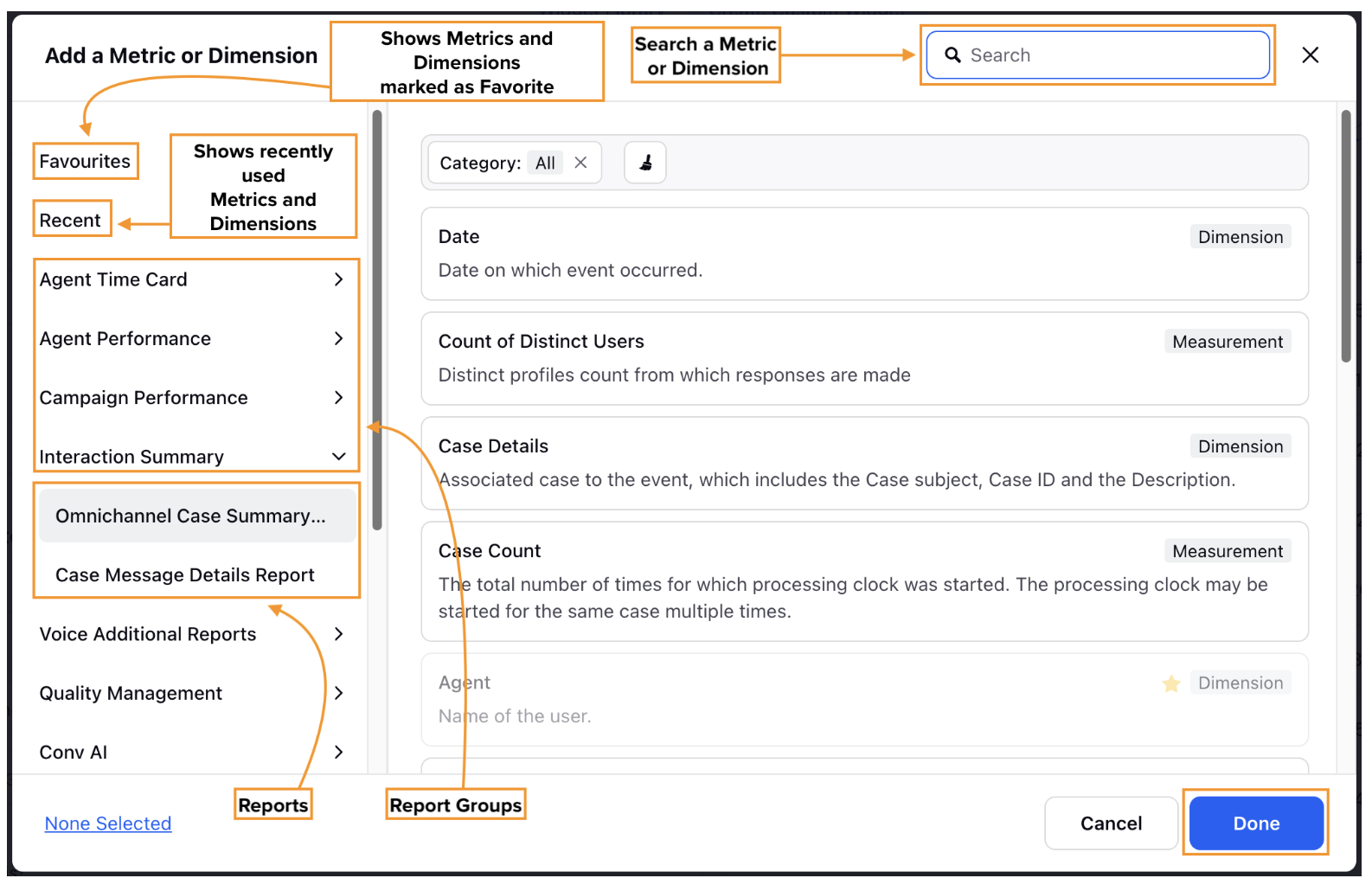
Below are all the options available and their descriptions:
Favorites: This shows all the Metrics and Dimensions you have marked as Favorites. A star icon indicates metrics and Dimensions marked as Favorites.
Recent: This option shows Metrics and Dimensions that have been recently used.
Report Groups: Report Groups are a collection of related Reports. Clicking a Report Group will show a drop-down menu listing related Reports. In case if you specifically want to view the report related to Service you can scroll down and look for Service Reporting Analytics Report Group will contain a collection of relevant reports.
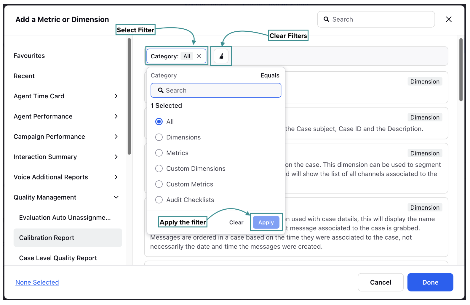
Once a suitable Report Group and Report is selected, you can select the required Metric or Dimension from the list. Some of the Reports that fall under Service Reporting Analytics are. These Reports will come up when we select Social Analytics as a Data Source:
Voice Agent Performance Report: Voice agent performance report gives detailed information about the performance of the agent and all the metrics/dimensions are based on agent level.
Survey Response Detailed Report (Single Dimension): Provides details of the responses/ answers received from the customers on the Surveys for all the questions.
Voice Report (Customer): The Voice Report (Customer) provides comprehensive details about calls from a customer perspective, covering both inbound and outbound calls.
Case SLA Report: The Case SLA Report is used to find each action-level report on a Case. This allows you to report on each agent assignment, Queue Removal, and brand response.
Omnichannel Case Summary Report: The Omnichannel Case Summary Report contains Metrics and Dimensions that provide information about Case-level data from the time a case is opened or created in the system until its status is closed.
Case Macro Usage Report: The Case Macro Usage Report serves as a comprehensive record of all macros applied to cases within the system.
Manage Dimensions and Metrics
Filter Option: You have the ability to filter the Metrics and Dimensions by clicking on Category Option and further select respective channels associated with them. Let's have look at it:
Dimensions
Metrics
Custom Dimensions
Note: Upon selecting the custom dimension you can select the Asset class associated with it such as Case, User, and Account, to refine your search.
Custom Metrics.
Once you have selected a filter click Apply button to apply.
Clear Filter: Helps to remove any selected filter in the Category Option.
Manage Widget Level Configuration
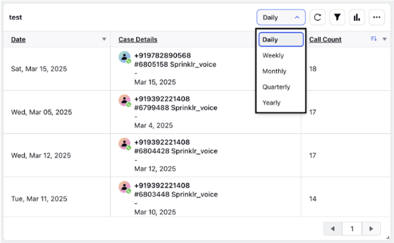
Date Aggregation Option: The data aggregation feature can now be directly accessed from the widget, making it more easily visible and accessible upfront. You can quickly sort the frequency of data on an hourly, daily, weekly, monthly, quarterly, or yearly basis. This enhancement improves the user experience by providing seamless time-based reporting and easier access to date aggregation settings within a single widget.
Note: The hourly split will be visible for the last 14 days or less, while the 15-minute and 30-minute splits will only be available for data from the last 7 days or less.
Note:
The number of documents that this widget can query is limited.
This query is estimated to process [estimated document count] documents, which exceeds the maximum allowed limit of [maximum allowed documents] (default: 50 million).
To resolve this issue, try one of the following:
Narrow the time range of your query.
Apply more specific filters to reduce the number of documents being processed.
Please note that filters applied to current custom properties do not reduce the document count used for limit calculations. This means the query will process the same number of documents regardless of whether these filters are included.