Chat Trigger Icon
Updated
The Live Chat trigger icon is the clickable icon displayed on your website that users click to start a chat session.

Icon Logo
You can choose from 6 predefined icon logos or upload a custom icon under "Image". The 6 predefined icon logos can be found under Styling > Chat Trigger Icon > Layout

If you want to display a custom icon, please select "Image" and choose the relevant icon from DM or upload from device. You can select upto 10 images; if more than 1 image is selected, a random image will be chosen on page visit. You can also report on the count of chat trigger icon clicks per image.
When a custom image/avatar is used as a chat trigger logo, we cannot add custom text to it.
Please ensure the below requirements for the custom image:
The image should be square
The image should not have a transparent background (jpeg files preferred)
Image size should be at least 100*100

Icon Text
You can add an optional text to the chat trigger icon. The optional text is only visible on desktops. On mobile devices, that text is hidden and just the icon is shown to save space on the small screen.
To add text, Add the desired text in section show below under “Styling > Chat Trigger Icon > Layout”

Once you add the text, it is shown like this on desktop and mobile


Desktop Mobile
Chat Trigger Background Color
The default color of the live chat trigger icon corresponds to the primary color selected for the live chat widget. You can change the trigger icon’s styling based on conditions such as agent unavailability, out-of-business hours, etc.
For example, when an agent is unavailable, the background color will dynamically shift to red. Otherwise, it will remain green, which is the default color for the live chat widget. The system will autonomously assess agent availability at regular intervals, ensuring the icon color changes dynamically without requiring a page refresh.
 Enablement note:
To get this capability enabled, please reach out to our support team at tickets@sprinklr.com, providing the live chat application ID, the desired hex code for the color, and the conditions triggering the color update.

Chat Trigger Border Color
You can make the following changes in your chat trigger border
Border Radius
Box shadow
In order to change this please raise a support ticket containing the appID and the values for the aforementioned attributes.
Minimize Icon
While configuring the Live Chat application, you can customize the icon that is used to minimize the Live Chat widget as either chevron or cross. If not set, the cross ( ) cross icon will be the default icon. You can do this from Styling > Chat Trigger Icon > Layout.

Note: A single close (X) button has been introduced to close both the Proactive Prompt and the Live Chat widget together for improved user exprience. This feature requires backend configuration. To enable this feature in your environment, contact Sprinklr Support at tickets@sprinklr.com.
Collapsible Slider
You can effectively grab user attention by utilizing a collapsible slider feature of the chat trigger icon based on user's browsing activity, agent availability, or other customized metadata.
Note: To get this capability enabled, please reach out to our support team at tickets@sprinklr.com.

Vertically Aligned Text Label
Depending on your brand's design language and use cases, you can have vertically aligned text label of the chat trigger icon.
Note: To get this capability enabled, please reach out to our support team at tickets@sprinklr.com. Please include the placement details of the chat trigger icon and padding specifications indicating where the live chat should originate from.
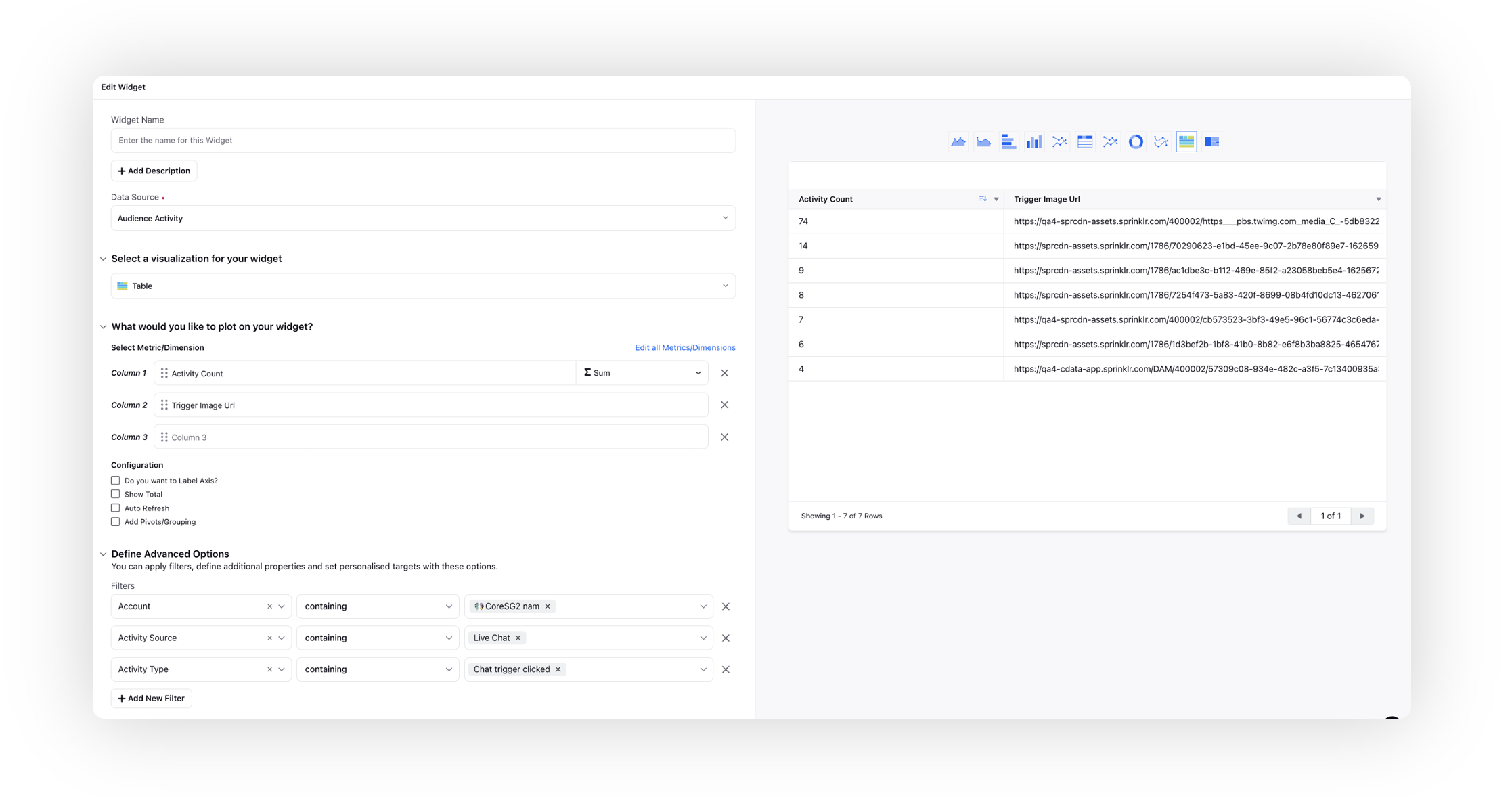
Dynamic Chat Trigger Icon Clicks
You can track the click count for each image of the dynamic chat trigger icon. You can achieve this by plotting the "Activity Count" metric against the "Trigger Image URL" dimension. Apply filters for the desired account, Activity Source as "Live Chat", and Activity Type as "Chat Trigger Clicked." This allows you to analyze and measure the engagement level of specific chat trigger images.
Conditional UI for Live Chat Trigger Icon
The Conditional UI for the Live Chat Trigger Icon enables dynamic updates to the chat widget icon based on user status and business context. This feature provides users with immediate visual cues indicating whether they will be interacting with a bot or a live agent, improving transparency and setting accurate expectations.
The trigger icon reflects real-time interaction availability. Depending on user login status and business hours, the widget icon dynamically updates to show either an AI Bot icon or a Live Agent icon.
Note: This feature requires backend configuration. To enable this feature in your environment, contact Sprinklr Support at tickets@sprinklr.com.
Behavior Logic
The icon displayed on the website adapts based on the following logic:
Condition | Trigger Icon |
User is logged in (regardless of business hours) | Show AI Bot icon |
User is not logged in AND during Business Hours | Show Agent icon |
Outside Business Hours, regardless of login status | Show AI Bot icon |
This behavior ensures that users always know whether they’re entering a bot-led flow or are likely to connect with a human agent.
Weightage-Based A/B Testing for Chat Trigger Icons
Live Chat now supports weightage-based A/B testing for Chat Trigger Icons. Percentage-based weightages (0–100%) can be assigned to different icon variants. Icons are served to users based on randomized traffic distribution according to the defined weightages.
Note: This feature requires backend configuration. To enable this feature in your environment, contact Sprinklr Support at tickets@sprinklr.com.
Draggable Chat Trigger Icon Across the Website
The Live Chat trigger can be configured to be fully draggable anywhere on the web page, rather than being fixed in place or limited to movement in a single direction.
Note: This feature requires backend configuration. To enable this feature in your environment, contact Sprinklr Support at tickets@sprinklr.com.
Hide Chat Trigger Icon While Scrolling
Live Chat can be configured to temporarily hide the chat trigger icon while a user is scrolling the page. This prevents the icon from distracting the user or overlapping with page content. Once scrolling stops, the chat trigger icon automatically reappears.
To hide the Chat Trigger icon while the user is scrolling the page, follow these steps:
Open the Live Chat Builder.
Navigate to Personalize Your Live Chat > Style and configuration.
In the Chat Trigger section, select Hide the chat trigger icon conditionally.
Choose the condition Is user scrolling the page and set it to YES.
