Dynamic GeoMap Widget – Compare by Topic & Theme Using Logos/Colours
Updated
Overview
The GeoMap (World Heat Map) widget has long provided users with a global view of metrics, but its functionality was limited to country-level comparisons without the flexibility to layer in business-relevant context. This constraint made it difficult to extract deeper insights or tailor visualizations to specific strategic themes. To address this gap, a new enhancement now allows users to break down metrics by custom topics or themes, enriching the map with branded visuals or tailored colour schemes. This update transforms the GeoMap into a dynamic, interactive tool for more meaningful storytelling within storyboard scenes.
Capability | Description |
Topic/Theme Grouping | Compare country-level data grouped by selected business topics or themes |
World Heat Map Enhancement | Widget now supports advanced breakdown beyond geographies |
Visual Display Options | Choose to show results using brand logos, color-coded pins, or both |
Region-Level Focus | Users can focus the heat map on specific continents or countries |
Custom Topic Limit Controls | Easily define the number of topics to display on the map |
Step-by-Step User Workflow
Ensure relevant topic/theme data is available in the workspace before starting.
Step 1: Open Storyboard & Scene Editor
Navigate to storyboard’s main dashboard
Search Geomap and open the World heat map
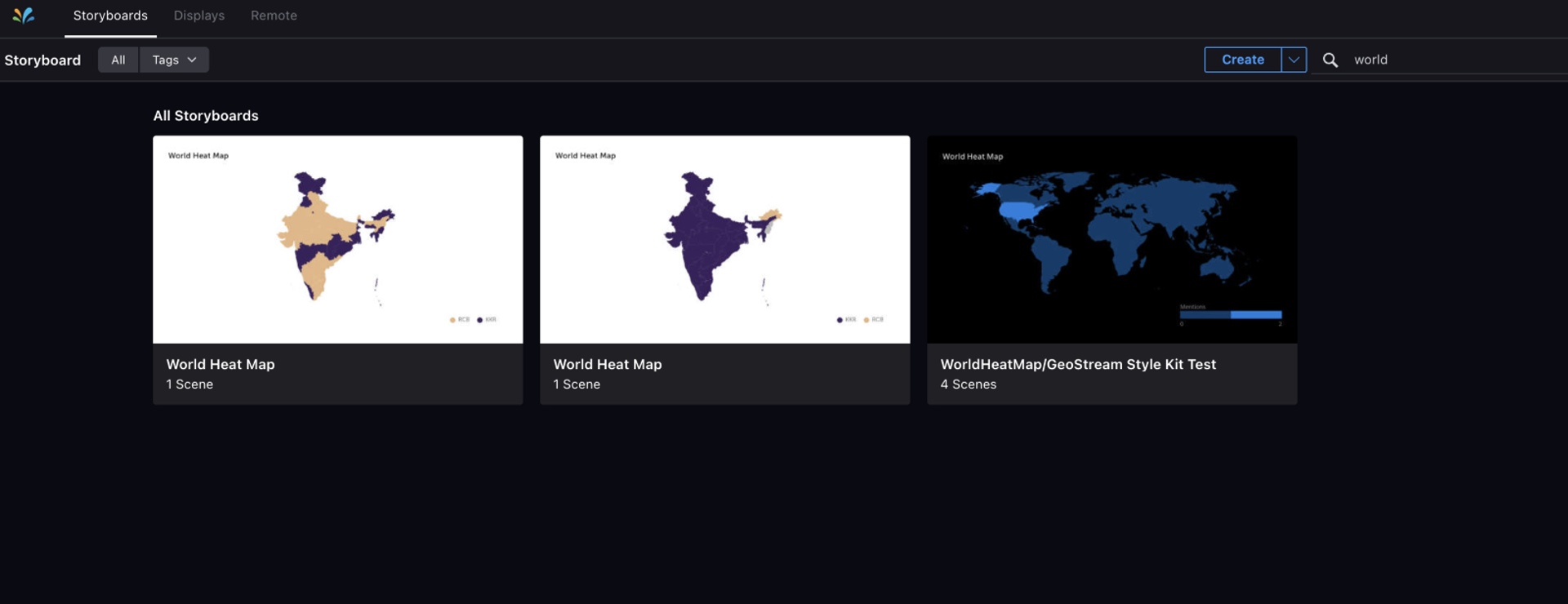
Step 2: Add GeoMap Widget
Click on Add Widget
From the widget options, select World Heat Map
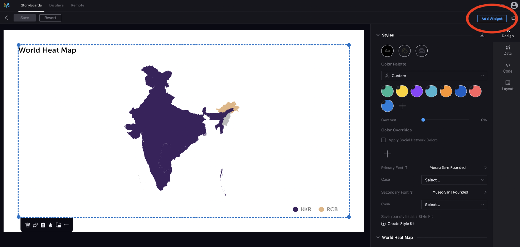
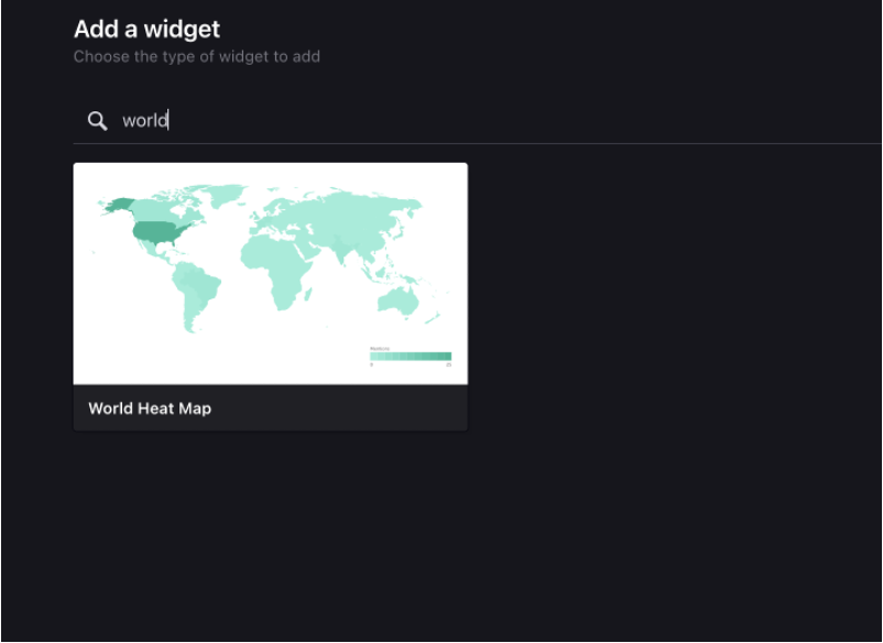
Step 3: Select Topics to Visualize
Once the widget is added, click on it to configure the data
Go to the Data tab
Under Group by, select Topic
Add a topic limit (e.g., 2 or 4) to define how many topics will be visualized
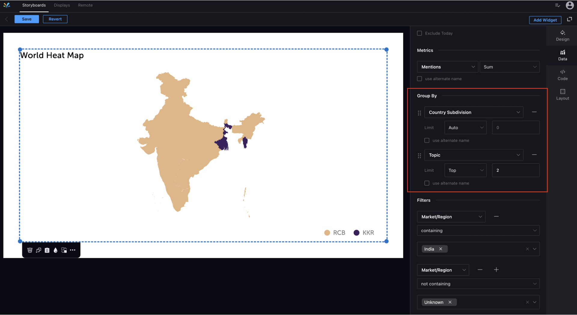
Step 4: Customize the Design and Map Display
Go to the Design tab of the widget
Choose World Heat Map view
Select the region to focus on (e.g., Global, Europe, Asia, Country Level subdivision)
Under Comparison Settings, choose how you want to visualize:
Logo View: Shows logos of the brands or topics at pinpoints
Colour View: Highlights geographies using topic-specific colours
Both: Combine logo and colour overlay for enhanced storytelling
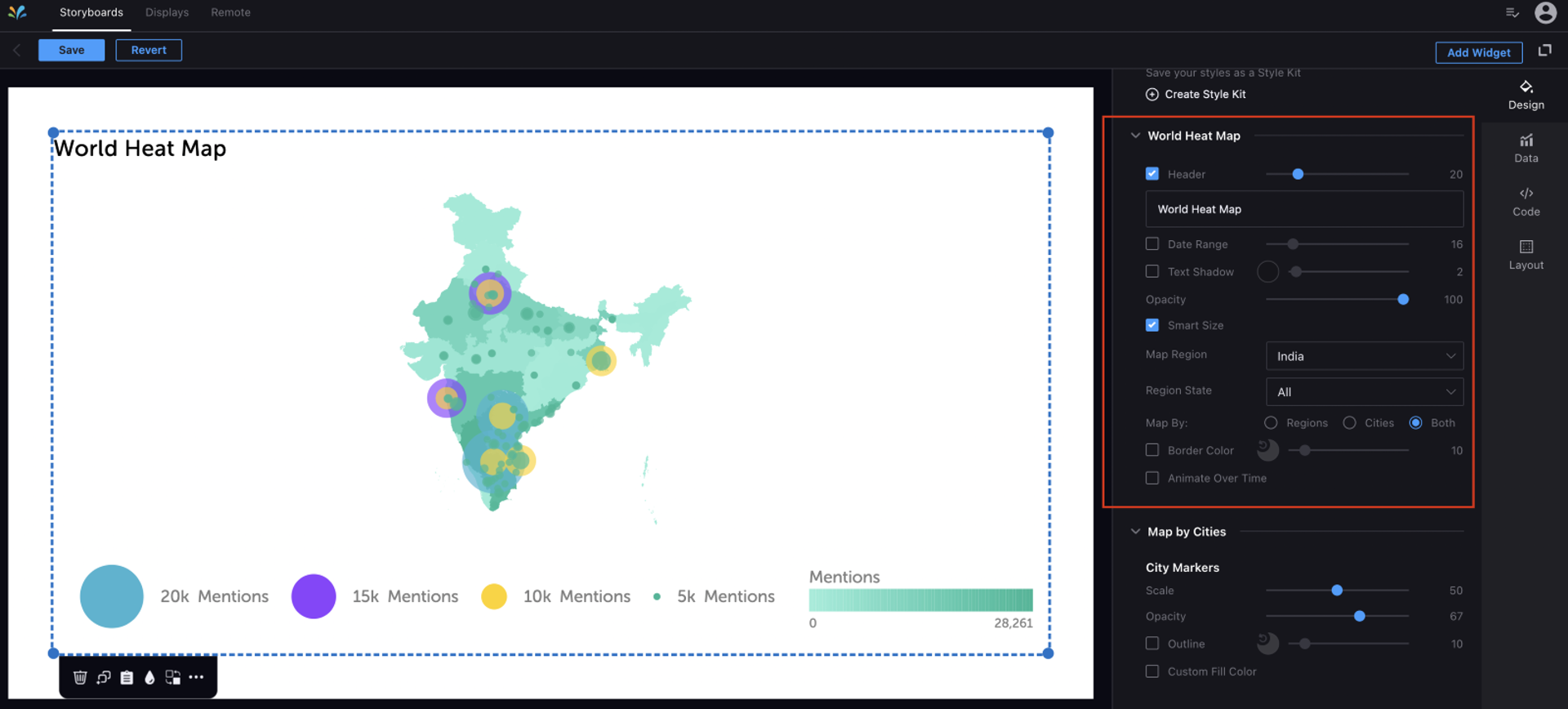
Step 5: Finalize and Resize/Adjust
Position the map widget appropriately within the scene
You can resize it like any other widget
Use the preview or publish mode to ensure layout integrity