Widget Summarizer - Benchmarking
Updated
The Widget Summarizer is a one-click feature that automatically generates top insights directly from a widget. It simplifies the process of insight discovery and significantly reduces the time to insights.
By analyzing data across various sources, the summarizer identifies and categorizes key themes or issues being discussed within the widget. Users can pin the summary next to the widget, enabling quick access to the most relevant insights.
This feature is especially valuable for executives and decision-makers who need to quickly understand what’s driving the data without diving into detailed reports.
Access Widget Summarizer
Access to this feature is controlled by the AI + Dynamic Property. To enable this feature in your environment, contact your Success Manager. Alternatively, you can submit a request at tickets@sprinklr.com.
Let's look at the navigation steps:
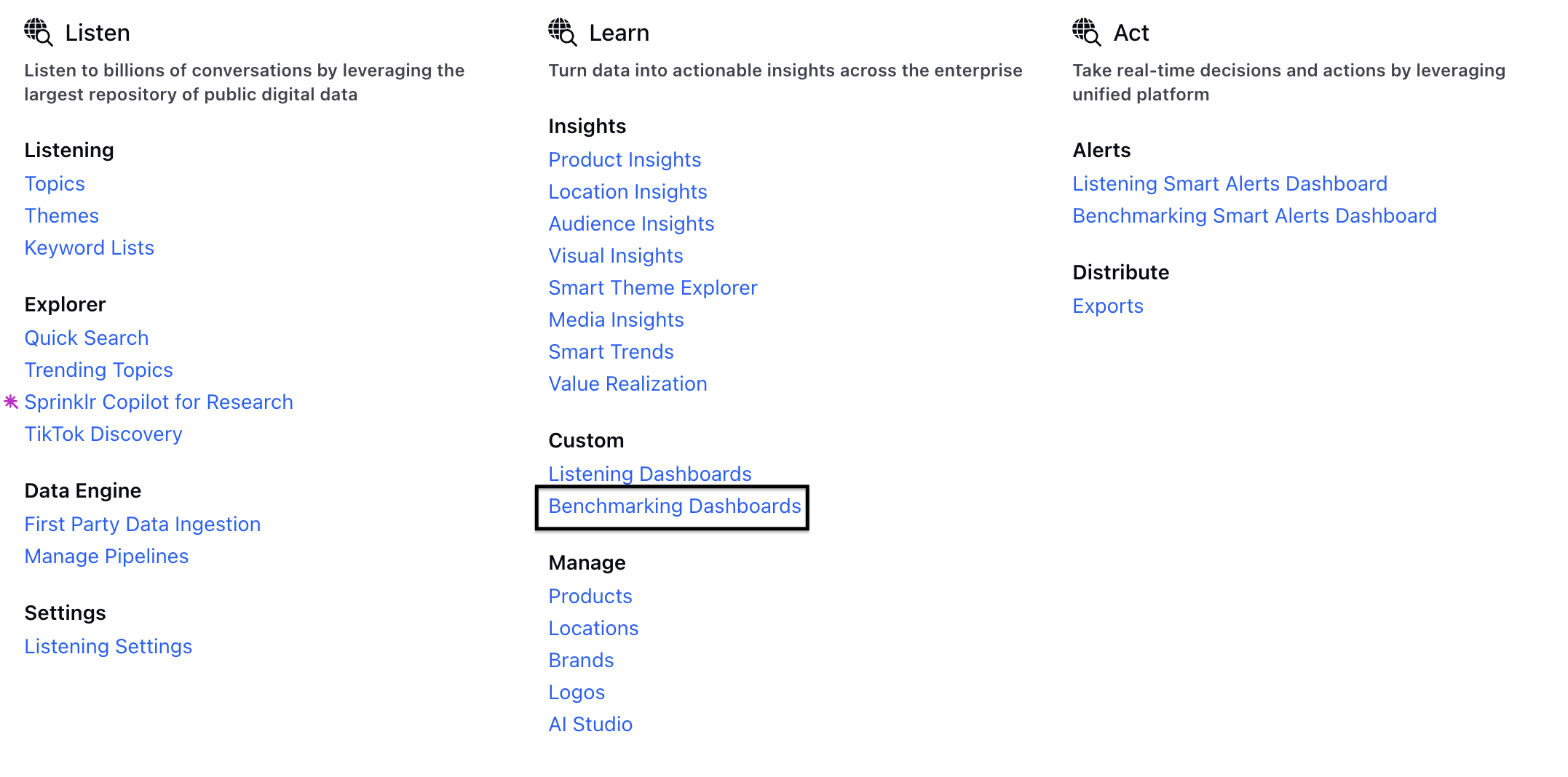
Go to + New > Sprinklr Insights > Benchmarking Dashboard (In the Learn Column under Custom).
Click Benchmarking Dashboard.

Open a Dashboard on Benchmarking Dashboard Record Manager. If the Dashboard is inside a folder, open the folder and then open the Dashboard.
Click Generate Summary button towards the top right of the Widget. There will be a loading message that will appear. The widget summarizer will render a streaming response.

The flicker keeps rotating till the entire content gets streamed.

Note: The Widget Summarizer is currently supported on 9 visualizations:
Pie Chart, Column Chart, Stacked Bar, Stacked Column, Line Chart, Spline Chart, Area Spline, Table and Area.
Once the Summary is generated, you will have the option to Copy the summary.
Click Pin Summary to pin the summary to that particular widget.

Example: If your widget is initially set to 30%, clicking Pin Summary will expand the widget to 100%.
On Summary, you can perform the following activities:
Refetch button: Whenever the summary is stale, click the refetch button to generate a new summary.A stale summary will appear if you apply additional filters, update any metric or dimension, or change the chart type that differs from the original setup. If the summary is outdated, you can click the Refetch button to regenerate it with the updated filters.
Timestamp: Tells the time when that particular summary was generated.

Summary Details: Click Summary Details option to check the filters used at the time of summary generation. It will give us the configuration of the widget at the time of summary generation. You will get this option on pinned summary.
Like: Click Like button to express satisfaction.
Dislike: Click the Dislike button to express dissatisfaction with the summary and provide feedback. You can choose from the available feedback options or add your own custom comment. You have the ability to select the reason for dislike from the predefined feedback options or you can feel free to add specific details aswell.

Translate: Widget summary will always be generated in the user's platform language. The user will also have the option to change the language from the UI using the translate option. Example: If the user's platform language is English, the user can change the language to Arabic.

Note: This option is transient and not permanent, which means if the user leaves the screen or refreshes the dashboard, the language will change back to the user platform language again.
Emojis: Sentiment for each category is visually represented with an emoji, showing positive, negative, or neutral sentiment for each summary point.
