Area Spline widget
Updated
An Area Spline Widget is a type of chart that is used to display a time series of data, where the data points are connected by a smooth curve that fills the area under the curve.
The area spline widget consists of a series of data points plotted on a Cartesian coordinate system, with the x-axis representing time and the y-axis representing the value of the data. The area under the curve between adjacent data points is then filled with a solid color, creating the appearance of a shaded area.
This widget can be used to help reveal patterns and trends in the data that may not be apparent from a simple line chart or scatter plot.
To create an Area Spline widget
To plot an Area Spline widget, you can use any existing editable dashboard or create a new one. Refer to this article to learn how to set up a Custom Dashboard.
Once you have the dashboard where you want to add the visualization widget, follow the steps below –
On the custom dashboard, click Add Widget in the top right corner.

On the widget builder, enter the widget's name and select Listening as Data Source.
Select Area Spline as a visualization type for your Listening widget.
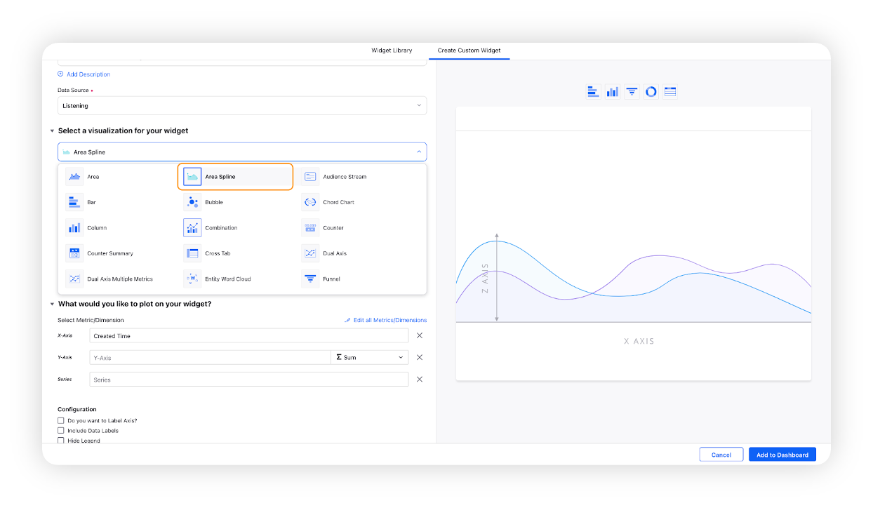
Under the What would you like to plot on your widget section, you will be given the below fields –
X-Axis: Select the required dimension. Here Created Time will be selected by default, which will be editable.
Y-Axis: Select any metric/custom metric to be plotted on Y-Axis, e.g. Mentions.
Series: You can choose any dimension to plot them in a series view, e.g. Sentiment. This will create three lines for positive, negative, and neutral sentiment.
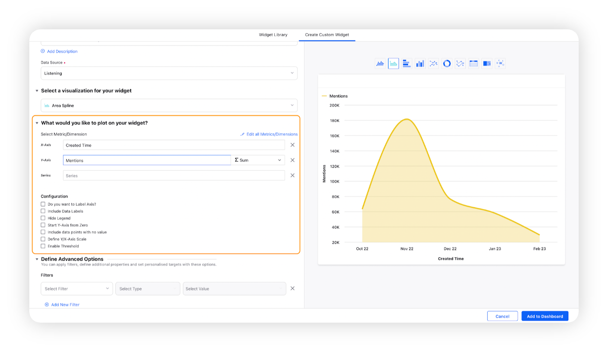
Select the configuration options as desired. For more information, refer to the Configuration options section below.
Under the Defined Advanced Options section, you can apply filters, define additional properties and set personalized targets with these options.
Click Add to Dashboard on the bottom right corner to create your new widget.
Configuration options
The configuration options available for the Area Spline widget will work as follows –
Configuration Option | Action |
Do you want to Label Axis? | If you want to add names for your Axis, you can select this configuration option, and then you can enter the desired names as labels. |
Include Data Labels | Selecting this option will include the data labels on the Spline widget. |
Hide Legend | Selecting this option will hide all the legends on the widget. |
Start Y-Axis from Zero | Selecting this option will start the Y-Axis (vertical axis) widget from zero (0). Although the Y-axis will start from zero, sometimes the scale will be shown as negative, catering to the bubble size. |
Include Data points with no value | Selecting this option will include the data points that do not have any value. |
Define Y/X-Axis Scale | You can define the Min & Max of X-Axis and Y-Axis bounds. Also, you can adjust the step size of the X-Axis and Y-Axis to get the best-optimized visualization. For example, you can switch the scale, i.e., for X-Axis → Minimum to Maximum or Maximum to Minimum; and Y-Axis → Minimum to Maximum or Maximum to Minimum depending on the use case, like for SLA Response time - less value means better performer. Therefore, the scale can be changed for reporting purposes catering to all the use cases. For more information, refer to Define Y-axis scale in Widgets. |
Enable Threshold | You can define a custom threshold to benchmark the overall data with it.
|