Percentage Area Widget
Updated
A percentage area graph is a type of data visualization that displays the distribution of a dataset as a percentage of the whole. In this type of graph, the total area of the graph represents 100% of the data being measured, and each individual segment represents a proportion of that whole.
The Percentage Area widget can be customized with different colors, labels, and axis scales to communicate complex data clearly and concisely.
To create a Percentage Area widget
To plot the Percentage Area widget, you can use any existing editable dashboard or create a new one. Refer to this article to learn how to set up a custom dashboard.
Once you have the dashboard where you want to add the visualization widget, follow the steps below –
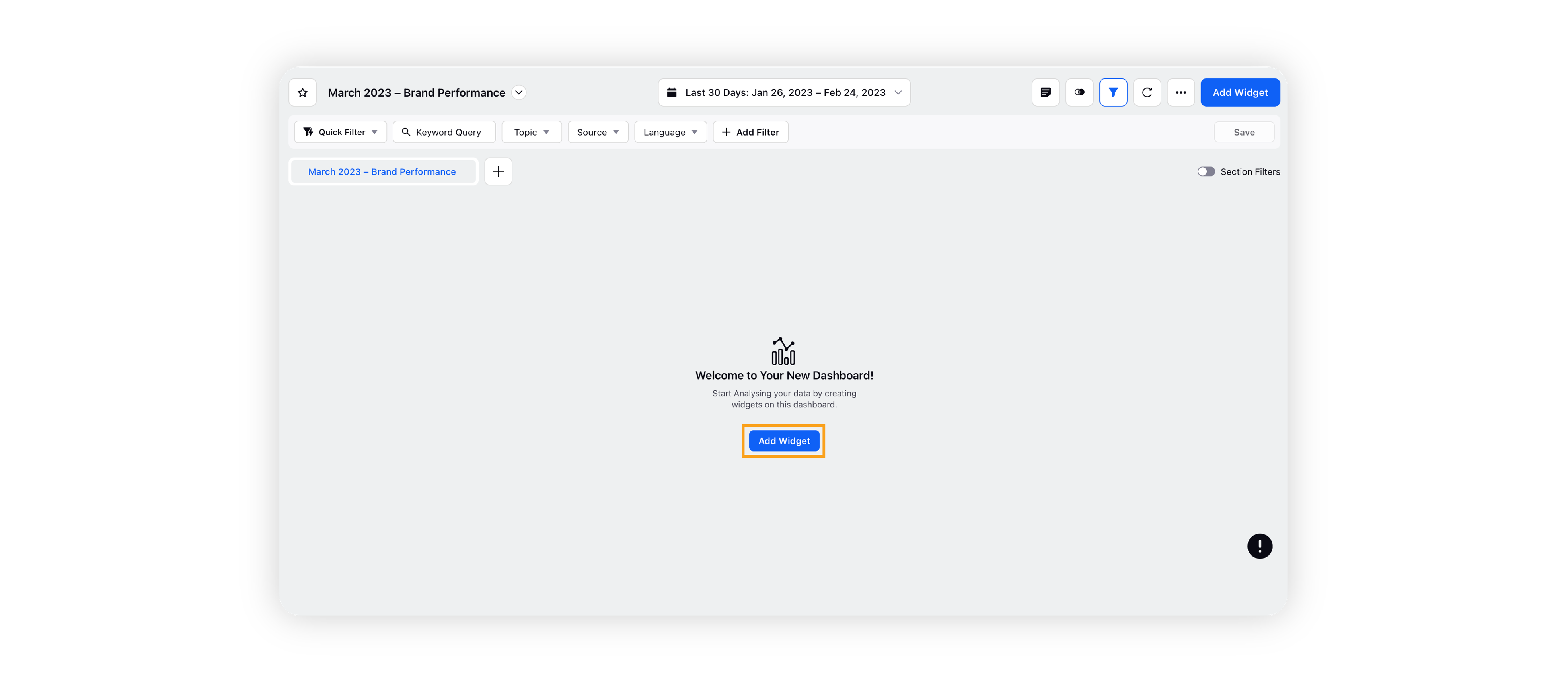
On the custom dashboard, click Add Widget in the top right corner.
On the widget builder, enter the widget's name, and select Listening as Data Source.
Select Percentage Area as a visualization type for your Listening widget.
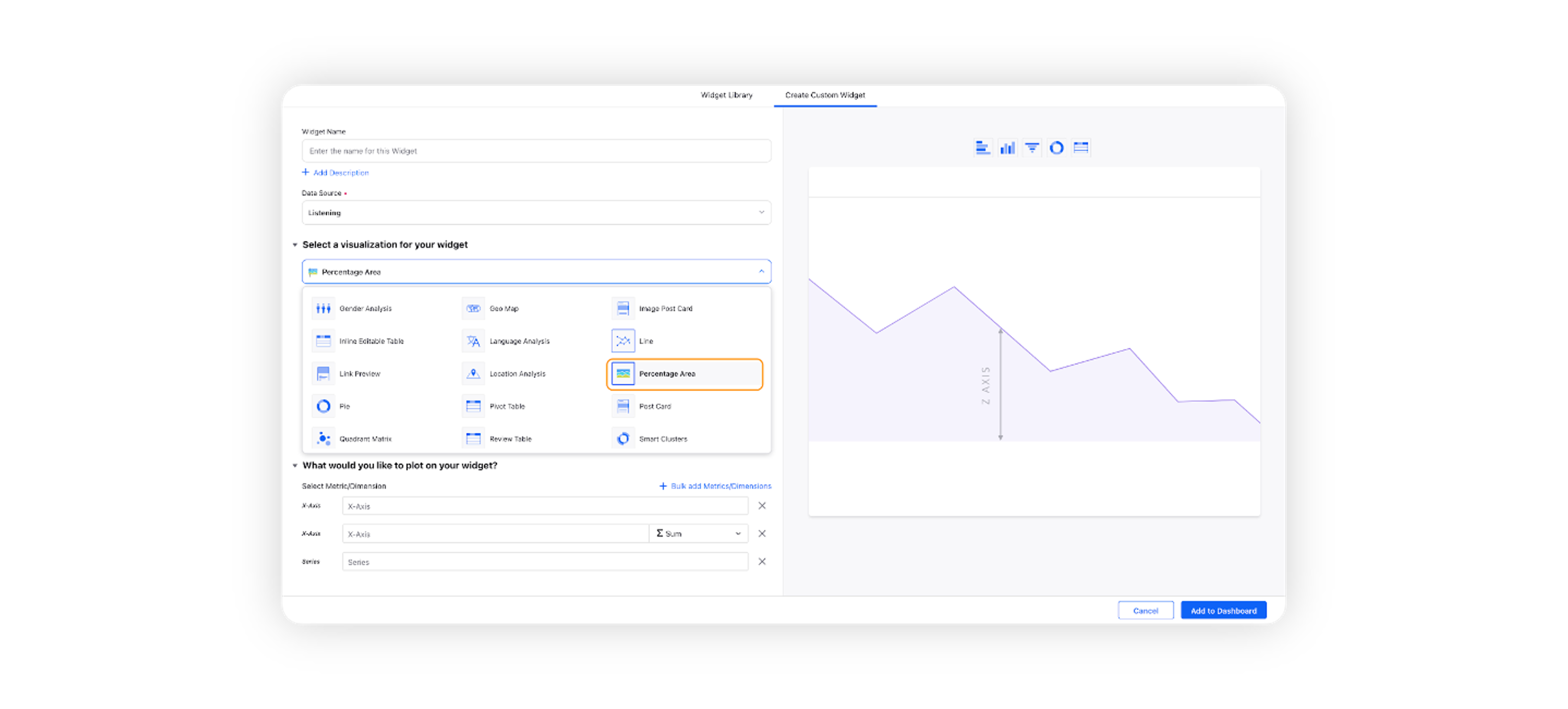
Under the What would you like to plot on your widget? section, you will be given the below fields –

X-Axis: Select the required dimension. Here Created Time will be selected by default, which will be editable.
Y-Axis: Select any metric/custom metric to be plotted on Y-axis, e.g. Mentions.
Series: You can choose any dimension to plot them in a series view, e.g. Sentiment. This will create three different lines and shaded areas for positive, negative, and neutral sentiment.
Select the configuration options as desired. For more information, refer to the Configuration Options section below.
Under the Defined Advanced Options section, you can apply filters, define additional properties and set personalized targets with these options.
Click Add to Dashboard on the bottom right corner to create your new widget.
Configuration options
The configuration options available for the Quadrant Matrix widget will work as follows –
Configuration Option | Action |
Do you want to Label Axis? | If you want to add names for your Axis, you can select this configuration option, and then you can enter the desired names as labels. |
Include Data Labels | Selecting this option will include the data labels on the Percentage Area Widget. |
Hide Legend | Selecting this option will hide all the legends on the widget. |
Include Data points with no value | Selecting this option will include the data points that do not have any value. |