Stacked Column widget
Updated
The Stacked Column widget is a type of chart that represents data with multiple categories or groups and compares the total value of each category while also showing the relative contribution of subcategories to that total.
In a Stacked Column chart, the categories are represented by vertical bars that are divided into smaller segments, each of which represents a subcategory. The height of each segment is proportional to the value of the subcategory, and the total height of the bar represents the total value of the category.
The advantage of a Stacked Column chart is that it enables easy comparison of the total values between different categories while also allowing viewers to see how the subcategories contribute to each category. This makes it an effective way to visualize data that has both a total value and subcategories.

To create a Stacked Column widget
To plot a Stacked Column widget, you can use any existing editable dashboard or create a new one. Refer to this article to learn how to set up a custom dashboard.
Once you have the dashboard where you want to add the visualization widget, follow the steps below –
On the custom dashboard, click Add Widget in the top right corner.

On the widget builder, enter the widget's name.
Select Stacked Column as a visualization type for your widget.
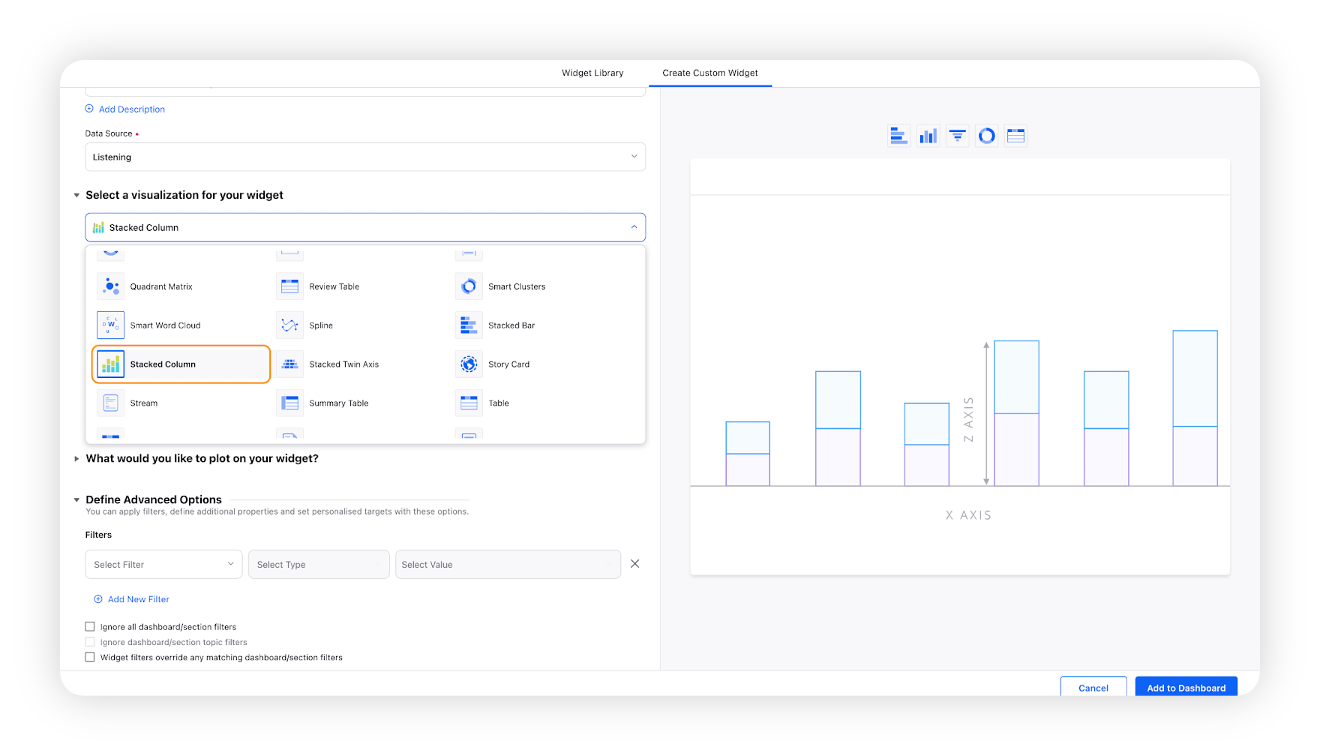
Under the What would you like to plot on your widget section, you will be given the below fields –
X-Axis: Select the required dimension. Here Created Time will be selected by default, which will be editable.
Y-Axis: Select any metric/custom metric to be plotted on Y-axis, e.g. Mentions.
Series: You can choose any dimension to plot them in a series view, e.g. Sentiment. This will create four lines for positive, negative, neutral, and uncategorized sentiment.
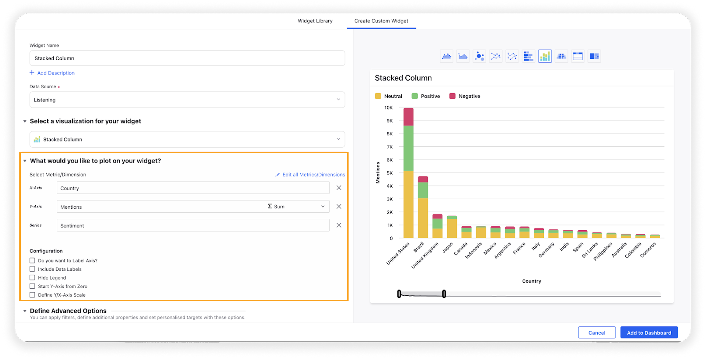
Select the configuration options as desired. For more information, refer to the Configuration Options section below.
Under the Defined Advanced Options section, you can apply filters, define additional properties and set personalized targets with these options.
Click Add to Dashboard on the bottom right corner to create your new widget.
Configuration options
The configuration options available for the Stacked Column widget will work as follows –
Configuration Option | Action |
Do you want to Label Axis? | If you want to add names for your Axis, you can select this configuration option, and then you can enter the desired names as labels. |
Include Data Labels | Selecting this option will include the data labels on the Spline widget. |
Hide Legend | Selecting this option will hide all the legends on the widget. |
Start Y-Axis from Zero | Selecting this option will start the Y-Axis (vertical axis) widget from zero (0). Although the Y-axis will start from zero, sometimes the scale will be shown as negative, catering to the bubble size. |
Define Y/X-Axis Scale | You can define the Min & Max of X-Axis and Y-Axis bounds. Also, you can adjust the step size of the X-Axis and Y-Axis to get the best-optimized visualization. For more information, refer to Define Y-axis scale in Widgets |