


Transform CX with AI at the core of every interaction
Unify fragmented interactions across 30+ voice, social and digital channels with an AI-native customer experience platform. Deliver consistent, extraordinary brand experiences at scale.


Customer Service Dashboards: Types and Examples (+ How to Design Yours)

In 2026, customer service sits at the intersection of revenue protection, brand trust, and operational efficiency. Every interaction, human or automated, creates an immediate downstream impact. Yet many enterprise leaders still operate with limited visibility into how service performance unfolds across channels, teams, and technologies in real time.
Modern service environments generate enormous volumes of data from voice, chat, messaging, social, self-service, workforce systems, and Voice of the Customer (VoC) programs. The challenge is no longer access to data, but converting it into clear, timely signals leaders can act on. Without a unified view, decisions skew reactive, accountability weakens, and service risks surface only after customers feel the consequences.
This is why the customer service dashboard has become a strategic instrument for modern enterprises.
Today’s customer service dashboards deliver a live, decision-ready view of demand, capacity, automation effectiveness, and experience outcomes, aligned to how customer service actually operates at scale. They allow leaders to spot emerging issues as they form, prioritize interventions with confidence, and keep frontline execution aligned with executive intent.
As service models grow more digital, automated, and AI-driven, how these dashboards are designed and used has become a defining capability. The sections that follow break down how modern enterprises approach customer service dashboards, the components that matter most, and what it takes to build one that supports real decision-making.
Understanding customer service dashboards and why they matter
A customer service dashboard is a visual operating system that consolidates service KPIs, interaction volumes, sentiment signals, and SLA performance into a single, shared view. At enterprise scale, its value is not defined by the number of charts it contains. It is defined by how quickly it converts fragmented operational signals into a prioritized issue that someone can own, act on, and resolve.
The most effective customer service dashboards consistently do three things well:
- Unify live customer service data so leaders can understand service conditions across customer service channels, teams, and geographies without toggling between systems.
- Surface early signs of risk, from subtle customer sentiment deterioration to emerging SLA drift, before they translate into customer-visible failures.
- Support decisive action by connecting performance signals to operational levers such as staffing adjustments, routing changes, or escalation paths.
Industry research from Gartner reinforces this shift. As service organizations scale digital and automated channels, dashboards are evolving from reporting tools into real-time operational control layers that support faster decision-making, tighter accountability, and more predictable service outcomes.
Key features of effective customer service dashboards
In large enterprises, customer service dashboards succeed or fail based on one criterion: do they help leaders make better decisions, faster, with confidence?
Visual polish and metric density are secondary. The most effective customer service dashboards share a set of design principles that go well beyond real-time charts or configurable widgets.
- Real-time operational visibility with decision context
Effective dashboards operate on live or near-live data pipelines, enabling you to track shifts in demand, backlog, service levels, and sentiment as they occur. More than speed, the real value is contextual awareness. Executives and operations leaders need to understand what changed, where it changed, and why it matters before issues cascade across regions or channels.
Customer service dashboards built on event streaming and low-latency architectures allow supervisors to intervene during emerging volume spikes, routing failures, or capacity mismatches while there is still time to correct course.
- Role-based views that reflect accountability
Enterprise customer service dashboards must adapt to the distribution of responsibility across the organization. A head of customer service, a regional operations leader, and a frontline supervisor are all accountable for different outcomes, and their dashboard views should reflect that reality.
Effective customer service dashboards support deep customization and filtering by role, geography, channel, and time window. They eliminate the need for manual exports and static reports by allowing leaders to drill down from executive summaries into operational detail without losing continuity. This ensures accountability is clear, and decisions are made with shared facts, not competing spreadsheets.
- True omnichannel integration, not channel silos
Modern customer journeys do not respect channel boundaries, and dashboards that do quickly lose relevance. High-performing customer service dashboards unify data across voice, live chat, messaging, social, email, and self-service systems into a single interaction fabric.
This unified view enables leaders to spot cross-channel patterns such as deflection failures, escalation loops, or repeated contact driven by broken customer self-service. For agents and supervisors, it provides the interaction history and context needed to resolve issues efficiently rather than treating each contact as an isolated event.
- Early risk detection and proactive intervention
Customer service dashboards become truly effective when they shift teams from reactive management to proactive control. This requires more than threshold-based alerts. Strong dashboards surface KPI drift, sentiment erosion, and operational anomalies early, before they register as missed SLAs or CSAT declines.
- Actionability embedded into the dashboard experience
Insight without action creates delay. The most mature customer service dashboards are tightly integrated with customer service workflows, enabling teams to move directly from detection to resolution. Whether triggering escalations, adjusting schedules, or reallocating capacity, dashboards should shorten the distance between insight and execution.
6 most used customer service dashboard examples
In modern enterprises, there is no single “master” customer service dashboard. High-performing organizations rely on a portfolio of dashboards, each designed to answer a specific class of decisions. The value comes from how these dashboards work together, creating continuity from frontline execution to executive oversight.
Below are the six customer service dashboard examples most commonly used by mature, enterprise-scale organizations in 2026.
1. Executive customer service performance dashboard
Primary users: CXO, Head of Customer Service, COO Decision focus: Strategic health, risk exposure, investment priorities
The customer service performance dashboard provides a consolidated, outcome-oriented view of service performance across the enterprise. It typically tracks service level attainment, cost-to-serve trends, customer satisfaction indicators, and backlog exposure, aggregated across regions and channels.
Its purpose is not operational management. It exists to help executives answer questions such as: where service performance is trending off plan, which regions or channels are under systemic risk, whether service investments are translating into measurable outcomes, and more. This dashboard favors signal over granularity, enabling leaders to detect issues early without drowning in operational detail.
2. Contact center operations dashboard
Primary users: Operations leaders, regional heads, command centers Decision focus: Daily control, stability, and throughput
This is the operational nerve center of customer service. It tracks live demand, queue depth, average handle times, staffing coverage, and SLA adherence across channels. The dashboard is designed for rapid interpretation and frequent use, often refreshed continuously throughout the day.
In large environments, this dashboard supports decisions such as:
- When to rebalance queues or reroute traffic
- How to respond to unexpected volume spikes
- Whether service degradation is localized or systemic
Its effectiveness depends on speed, clarity, and the ability to isolate problems before they cascade.
What dashboard layout makes forecast vs. actual intraday deviations obvious and fast?
The most effective layout is a time-series–first dashboard with variance overlays, designed for rapid visual detection rather than detailed analysis.
Leading enterprises use a single horizontal timeline (15- or 30-minute intervals) where forecast and actual volumes, handle times, or staffing are plotted together. Deviations are highlighted through explicit variance bands and directional indicators, allowing leaders to see when performance moves outside tolerance without having to scan multiple charts.
To accelerate response, high-performing dashboards pair this with:
- Threshold-based color cues that activate only when deviation crosses predefined limits
- Cumulative variance tracking to show whether the gap is correcting or compounding
- Inline annotations that flag likely drivers such as absenteeism, channel spillover, or routing constraints
3. Agent performance and productivity dashboard
Primary users: Team leaders, QA managers, workforce planners Decision focus: Coaching, performance management, capacity optimization
This dashboard connects individual and team-level performance to service outcomes. It commonly includes contact center metrics related to productivity, quality, adherence, and customer feedback, contextualized by channel and interaction type.
The most effective versions avoid ranking agents in isolation. Instead, they help leaders understand:
- Where performance gaps are skill-driven versus demand-driven
- Which coaching interventions will have the highest impact
- How agent experience correlates with customer experience
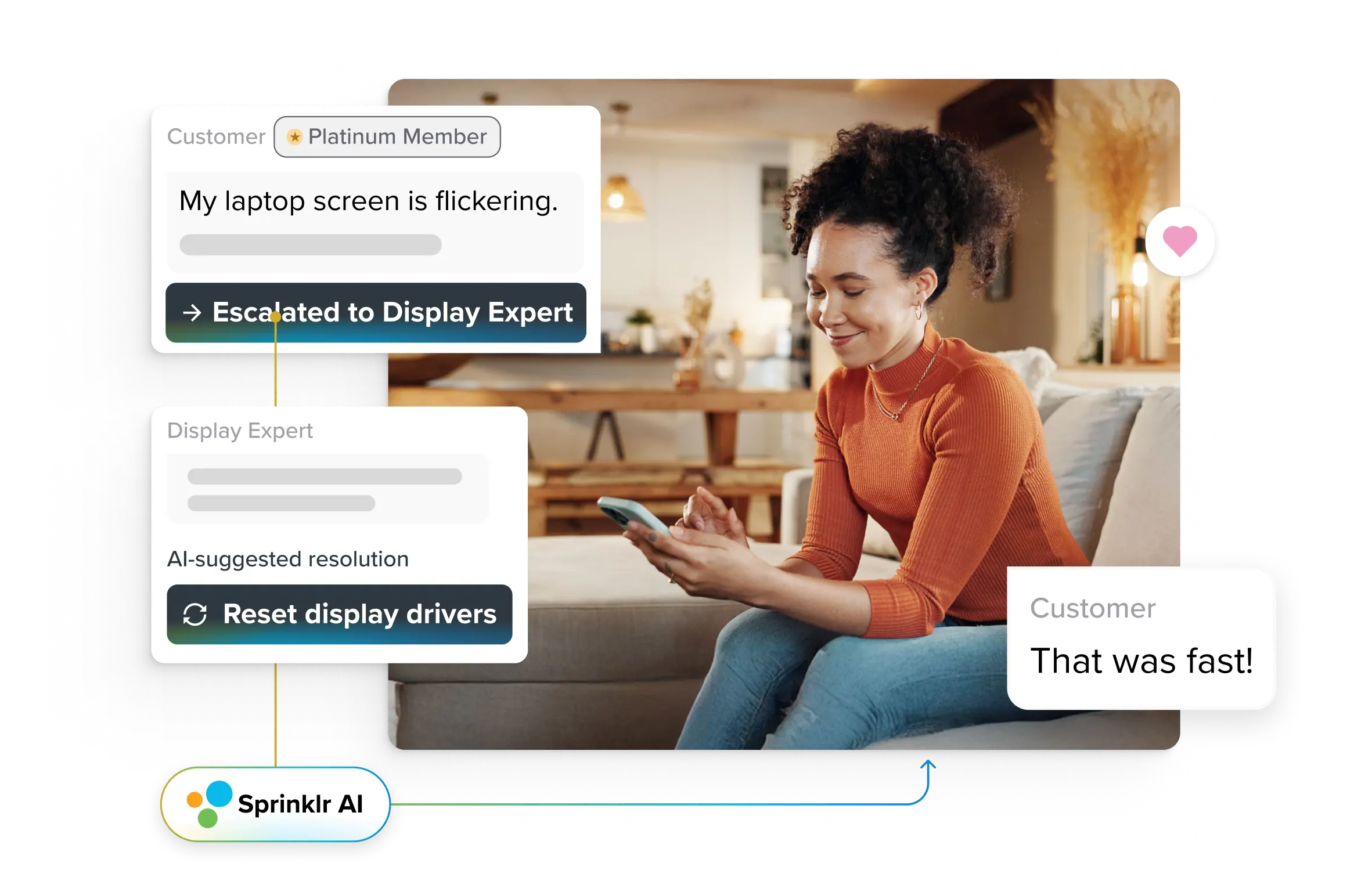
Deutsche Bahn’s agent performance dashboard in action
Handling close to a million social service messages annually, Deutsche Bahn needed real-time visibility into agent workload, response times, and SLA adherence across multiple channels and languages.
By centralizing social interactions into a unified agent desktop and agent performance dashboard, supervisors gained a live view of agent availability, case volumes, and productivity. Automatic tagging and rule-based routing ensured messages were categorized and assigned correctly, reducing manual effort and handling friction.
Key results achieved:
- 49% reduction in average case handling time
- 17% improvement in case processing time
- 34,000+ cases efficiently handled via Sprinklr
For Deutsche Bahn, the dashboard became a daily management tool, supporting faster coaching, clearer prioritization, and more consistent service execution at scale.
4. Omnichannel customer journey dashboard
Primary users: CX leaders, journey owners, digital teams Decision focus: Journey friction, repeat contact, channel effectiveness
Omnichannel customer journey dashboard shifts focus from internal performance to the customer’s experience across touchpoints. It visualizes how customers move between self-service, assisted channels, and escalations, and where breakdowns occur. Identifying journeys that drive repeat contact, detecting handoff failures between digital and human channels, understanding how channel mix impacts resolution, and effortare some of the common use cases. Its value lies in exposing cross-channel dependencies that siloed dashboards often miss.
5. SLA and compliance risk dashboard
Primary users: Service governance teams, enterprise risk leaders Decision focus: Exposure management, contractual compliance
This dashboard focuses on service commitments, internal or contractual, and how close your organization is to breaching them. It tracks SLA performance by client, queue, or region and highlights early warning indicators.
Rather than reporting breaches after the fact, mature SLA dashboards:
- Surface leading indicators of SLA drift
- Prioritize high-risk segments
- Enable preemptive corrective action
For regulated or B2B-heavy enterprises, this dashboard plays a critical role in protecting revenue and customer trust.
6. Customer sentiment and experience signals dashboard
Primary users: CX strategy teams, VoC leaders Decision focus: Experience quality, brand impact, emerging dissatisfaction
This dashboard aggregates customer sentiment, feedback trends, and experience indicators across customer service channels. Its purpose is to detect emotional and experiential shifts that operational metrics alone may not reveal.
Effective customer sentiment dashboards help you identify early signs of customer frustration or dissatisfaction, correlate experience signals with operational drivers, prioritize improvement initiatives based on customer impact, and more. When integrated with operational dashboards, sentiment data provides essential context for why performance metrics are moving.
How to design a customer service dashboard that drives action (+Tips)
A high-performing customer service dashboard is designed backward from action. It reflects how decisions are actually made during a live service day, under pressure, with imperfect information, and across multiple teams.
Here’s how experienced service leaders approach dashboard design when the goal is action, not awareness.
Start with decisions, not dashboards
Before debating layouts or metrics, step back and ask a simpler question: What decisions should this dashboard make easier?
A dashboard used by a service leader at 10:30 a.m. during an unexpected volume spike has a very different job than one reviewed in a monthly ops meeting. When dashboards are built around metric inventories, leaders are forced to interpret relevance on the fly. When they’re built around decision moments, relevance is obvious.
Make deviation impossible to miss
Effective dashboards spotlight instability. You should be able to glance at a screen and immediately see where service is drifting off plan, where risk is accumulating, and where intervention will have the highest impact.
This is why strong dashboards emphasize variance over raw values. Forecast versus actual views, visible tolerance bands, and cumulative deviation trends matter far more than perfectly formatted KPI tiles.
Respect how accountability works in real organizations
One of the fastest ways to break trust in a dashboard is forcing everyone to look at the same view. Executives, operations leaders, and frontline supervisors don’t need different truths, but they do need different lenses.
The best dashboards naturally align with accountability. Executives see trends in outcomes and systemic risks. Operations leaders see bottlenecks and control levers. Supervisors see execution detail. What ties these views together is a shared data foundation, not a shared layout.
Preserve context as people go deeper
Dashboards should support curiosity without fragmenting the story. When you drill into a problem, you should retain context — time window, channel mix, customer impact — rather than landing in disconnected tables or charts. When context is lost, conversations slow down. When it’s preserved, root causes surface faster, and decisions feel more confident.
Reduce the distance between insight and intervention
The most mature customer service dashboards don’t stop at insight. They connect directly to action whether that means triggering an escalation, adjusting staffing, or flagging an issue for immediate follow-up. When dashboards require multiple handoffs between detection and response, speed suffers. Actionable dashboards shorten that path.
💡Are you designing your customized customer service dashboard?
Here are a few things to know:
- Note that, if everything on the dashboard looks “healthy,” the design is likely masking early warning signals.
- Design drilldowns to answer, “why is this happening?” before “what else can I look at?”
- Measure how long it takes teams to act after an issue appears on the dashboard. That gap often reveals more than the metric itself.
- If a metric hasn’t influenced a decision in months, it may be informational — but it isn’t operational.
Turning customer service dashboards into an operating advantage
By 2026, the question is no longer whether enterprises need customer service dashboards. The real question is whether those dashboards are connected deeply enough to the reality of modern service operations to drive timely, confident action.
As customer journeys span channels, automation, and human support, customer service dashboards built on fragmented data and delayed reporting simply cannot keep up. You need a unified, live view of service performance — one that reflects how customers actually move across touchpoints and how operational decisions ripple through the system in real time.
This is where Sprinklr Service plays a decisive role.
- Sprinklr Service unifies data across every service channel, such as voice, messaging, chat, social, email, and self-service, feeding every interaction into a single, governed platform. This creates a complete, continuous view of customer journeys rather than disconnected snapshots across tools.
- Its live reporting and real-time intelligence layer keep leaders constantly aware of SLA health, volume shifts, and sentiment changes as they happen. Instead of discovering service drift after the fact, teams gain immediate visibility into where performance is trending off course.
- With Sprinklr AI, every conversation is analyzed continuously to detect emerging risk patterns, operational strain, and experience degradation. These AI-powered insights surface early warning signals, well before customers escalate or SLAs are breached, giving you the time and context needed to intervene decisively.
- Sprinklr Service also accelerates time-to-value through prebuilt dashboards for executive performance, SLA monitoring, agent productivity, and more. You can launch quickly, then layer in customization based on your operating model, governance needs, and decision structure.
- Most importantly, dashboards in Sprinklr Service are not isolated reporting surfaces. They include an embedded action layer that connects insight directly to execution. When a metric slips, your supervisors can reassign cases, adjust routing, trigger alerts, or create coaching tasks without leaving the dashboard. The distance between detection and resolution is intentionally minimized.
If you’re serious about scaling customer service without sacrificing experience, your customer service dashboard must function as an operating system, not a retrospective report. To get the fundamentals correct with expert assistance, book a demo today!
Frequently Asked Questions
A strong customer service dashboards template includes first response time, resolution time, CSAT, NPS, backlog volume, SLA status and sentiment signals across channels. These give leaders a clear read on quality and customer perception.
Operational dashboards work best when refreshed every few minutes so supervisors can act before queues build or sentiment drops. Historical dashboards can be updated less frequently, but anything used in daily operations needs near-real-time data to remain useful.
Yes. Supervisors, QA teams and executives each need different levels of detail, so dashboards work best when they’re role-specific. Custom views keep focus tight: frontline teams see what they must act on, while leaders see trends and outcomes.
Dashboards should combine ticket data, channel activity, SLA indicators, sentiment patterns, customer segments and agent performance. Pulling these into one view helps teams connect what’s happening and where to intervene next.
Customer service dashboards tie frontline performance to outcomes like resolution speed and customer satisfaction. It turns raw interaction data into real-time signals, helping teams maintain consistent service quality. Executives gain a clear line of sight into how daily operations support broader goals, such as revenue protection and cost control.
