


Transform CX with AI at the core of every interaction
Unify fragmented interactions across 30+ voice, social and digital channels with an AI-native customer experience platform. Deliver consistent, extraordinary brand experiences at scale.


Customer Experience (CX) Dashboard: Key Components and How to Gain Insights


As enterprises face mounting competition and rapidly evolving customer expectations, one thing is clear: it's no longer just about the products or services you offer — it's about the experience you deliver. And to manage that experience effectively, you need more than scattered reports and siloed insights.
That's where a customer experience dashboard comes in — a unified, visual command center that captures how customers truly feel and engage with your brand and where experience gaps are emerging in real-time.
When done correctly, a customer experience dashboard connects the dots between data and decision-making. Whether it's a sudden drop in net promoter score (NPS), rising ticket volumes, or signs of churn among customer groups, these dashboards serve as a critical focal point for strategic action, cross-functional alignment and customer-centric transformation.
In this blog, we'll break down what a customer experience dashboard is, what it should include, how to build one that drives insights — not just reports — and how to unlock its full potential to elevate your customer experience strategy.
What is a customer experience dashboard?
A customer experience (CX) dashboard is a centralized, visual reporting tool that aggregates, analyzes and displays real-time data about your customers' interactions, sentiments and behaviors across the customer journey. It acts as a live pulse check, offering a snapshot of how your brand is perceived and where experience gaps may exist.
In large enterprises, a CX dashboard goes far beyond vanity metrics. It becomes a strategic instrument for customer intelligence, enabling leaders to confidently align teams, prioritize initiatives and course-correct. Instead of digging through fragmented reports from marketing, support, sales and product, decision-makers can access a single source of truth that connects experience data to business outcomes.
Whether you're tracking NPS trends by region, customer satisfaction by channel, churn risk by segment, or sentiment shifts tied to product releases, the CX dashboard consolidates this intelligence in one place — making it easier to spot friction points, surface emerging patterns and guide proactive decisions that improve customer loyalty and lifetime value.
Top 4 benefits of CX dashboards
Here are four key benefits CX leaders can expect when they implement a unified customer experience dashboard:
1. Real-time visibility into customer health
CX dashboards aggregate signals from across touchpoints — support tickets, customer surveys, social sentiment, product usage and more — giving you a dynamic, up-to-the-minute view of how your customers feel and behave. No more waiting for quarterly reports to catch a churn trend after it’s too late.
2. Faster, smarter decision-making
By connecting customer experience metrics to operational and financial outcomes, customer experience dashboards help you prioritize what matters most. Spot a sudden dip in CSAT after a product update? You can immediately act before it snowballs into lost revenue or negative brand perception.
3. Cross-functional alignment
Whether you’re in marketing, support, product, or operations, a unified CX dashboard serves as a shared source of truth. It gets everyone rowing in the same direction, grounded in customer reality rather than department-specific assumptions.
4. Data-backed CX strategy and ROI tracking
With the right metrics and visualizations, customer experience dashboards tie initiatives directly to business outcomes. You can show how improving digital onboarding increased NPS or how shortening resolution time impacted repeat purchases — making it easier to justify investment and drive continuous improvement.
Key components and metrics of customer experience dashboards
A customer experience dashboard is only as good as the components it brings together— and how those components reflect the voice of the customer (VoC). While customer experience dashboards may vary depending on the business model, industry, or CX maturity, the most effective ones balance operational, behavioral and sentiment-driven insights.
Here are the key components and core metrics every CX dashboard should include:
1. Customer feedback and sentiment metrics
This is the foundation. Whether gathered through surveys, reviews, or social listening tools, sentiment data gives you a pulse on how customers feel at different journey stages.
- Net promoter score (NPS) – Are customers likely to recommend you?
- Customer satisfaction score (CSAT) – How satisfied are customers after a key interaction?
- Customer effort score (CES) – How easy was it for the customer to get an issue resolved?
- Sentiment analysis (from chat, email, or social) – What emotions drive feedback?
2. Support and service performance metrics
CX doesn’t exist in a vacuum. Your contact center metrics are often early warning signs of friction. Here are a few metrics you must stay vigilant about:
- First contact resolution (FCR) – Are issues being resolved in the first interaction?
- Average handle time (AHT) – Are customers getting timely support?
- Ticket volume trends – Are certain categories seeing spikes that need attention?
- Escalation rate – How often are cases being pushed to higher-tier teams?
3. Journey analytics and interaction data
Understanding what customers do and where they face hurdles across their journey is vital. This isn't just about mapping a linear path from awareness to purchase. In reality, customer journeys are nonlinear, multi-channel, and often fragmented. A strong CX dashboard stitches this data to show how customers move across touchpoints and where drop-offs or delight moments happen.
Key metrics and components include:
- Customer journey maps that auto-update in real-time as customers move across touchpoints.
- Interaction frequency and duration by channel (web, mobile, in-store, voice, chat).
- Drop-off and conversion rates at key funnel stages — onboarding, checkout, support, renewal.
- Touchpoint engagement scores show which channels or experiences drive or detract from value.
For example, if your dashboard shows a drop in repeat logins and rising support tickets during onboarding, you're likely dealing with a usability issue that's harming early engagement. Dashboards highlighting these interaction dynamics allow your CX and product teams to fix issues in flight.
4. Retention, churn and loyalty indicators
Most CX dashboards stop at satisfaction scores. But what your executive stakeholders care about is loyalty, lifetime value and churn risk. The best customer experience dashboards integrate behavioral, feedback and transactional data to surface warning signs before customers walk away.
Look for these metrics:
- Churn likelihood scores based on behavior shifts (reduced logins, slower usage, increased complaints).
- Customer retention rates across different cohorts or lifecycle stages.
- Repeat purchase or renewal rates are a good proxy for trust and perceived value.
- Engagement recency and frequency, especially in self-service environments, can show where engagement is fading.
- Customer lifetime value (CLV), enriched by NPS or sentiment tags, to segment high-risk vs. high-opportunity accounts.
5. Operational and business impact metrics
CX is often seen as a “soft” function until you tie it to hard business outcomes. A mature customer experience dashboard goes beyond operational visibility and connects experience data to financial performance. This helps customer leaders and BI teams justify investments in CX initiatives with clear ROI indicators.
Core business-impact metrics include:
- Revenue influenced by CX metrics like NPS or CSAT — are happier customers spending more?
- Cost-to-serve — can better experience reduce support costs through deflection or better onboarding?
- Upsell/cross-sell conversion rates, especially tied to improved service experiences or journey optimizations.
- Impact of CX improvements on average resolution time or employee productivity, both of which directly affect margin.
How to derive insights from a CX dashboard
A customer experience dashboard only works if you know what to look for and when. It’s about identifying the patterns, gaps, and pressure points that drive smarter decisions. Here’s how to make every click on your dashboard count:
📌 Before you start analyzing
Make sure you're not working with broken inputs. The best insights start with clean, credible data.
- Check data source coverage: Ensure your dashboard pulls in data from every critical touchpoint — email, live chat, voice, surveys, social, and even in-product behaviors. Overlooking even one channel could mean missing a valuable thread in the customer journey.
- Validate data freshness: A dashboard is only as good as its timestamp. Ensure your feed is near real-time or, at minimum, updated frequently enough to reflect live customer sentiment and service performance.
- Audit data quality: Spot inconsistencies, missing entries, or duplicated values that could distort trends. Remember that it isn't just about hygiene but the accuracy of what your team acts on.
- Understand the logic behind the metrics: Don't assume CSAT or FCR means the same everywhere. Know the calculation logic, data sources behind each metric, and — most importantly — what business levers each one connects to. It shouldn't be on the dashboard if your team can't act.
🔭 While analyzing the dashboard
Once your inputs are reliable, start asking the right questions.
- Look beyond the surface: Don’t just track NPS or CSAT in isolation. Ask: What happened before the dip? Was there a service disruption? A product issue? A policy change in support? Layer customer journey analytics with things like “time-in-stage” or “channel interaction volume” to pinpoint where friction emerged.
- Spot high-friction service areas: High AHT or surging open ticket volumes in a specific category? Don’t just flag it — diagnose it. Are agents struggling with complex customer service workflows? Are support policies unintentionally escalating issues? Use the dashboard to start asking operational “why’s.”
- Drill down into important segments: Your most valuable dashboards allow segmentation by customer type, region, lifecycle stage, product line, or support tier. Use those lenses. If enterprise clients are churning faster than SMBs, it might not be a broad issue — it could be a misaligned onboarding experience or inconsistent follow-ups in high-touch accounts.
- Pinpoint churn triggers: Look for early churn signals by connecting sentiment drops, rising complaints, or product usage declines with renewal timelines. Most customers don’t churn suddenly. Their story starts long before the contract ends. Your dashboard should help you read those signals before it’s too late.
Pro Tip: Track directional trends, not just point-in-time metrics
A bad week for customer satisfaction (CSAT) may not necessarily warrant concern, but a downward trend over three months certainly should. Dashboards should be designed to help you identify these directional shifts and connect them with relevant business contexts, such as product launches, pricing changes, or new support workflows.
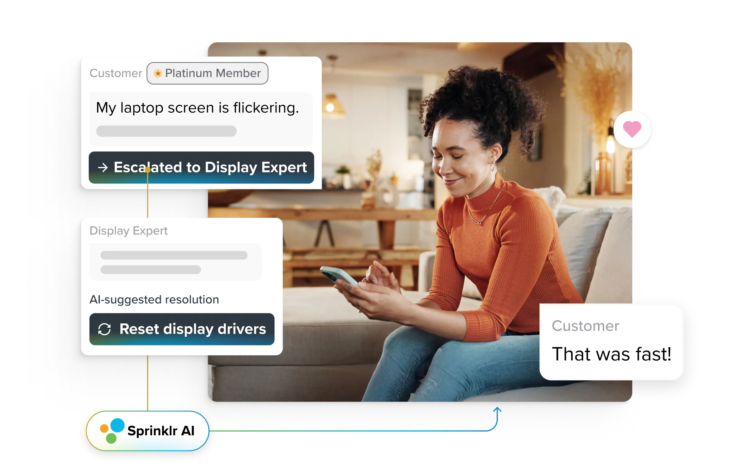
Choose dashboards that go beyond static KPIs. Look for ones that offer anomaly detection and change alerts — so your team spots meaningful changes, not just noise. That’s where Sprinklr’s conversational analytics comes in. Powered by Sprinklr AI, it not only detects root causes, anomalies, and trends across your contact center metrics — it also surfaces the top impact drivers and recommends the next best action to take. It’s insight, with intelligence built in.

- Surface unfiltered VoC: Don’t ignore the messy stuff — open-text responses, customer quotes, agent call notes. This unstructured VoC often reveals hidden customer pain points or emotional friction that structured fields simply miss.
- Cross-check with frontline insights: Your data tells one side of the story. Validate trends by checking in with frontline teams. Does the rise in complaints match what agents are hearing? Do sentiment drops align with policy changes they’re fielding calls about? This is your real-world sense check.
- Tie customer insights to operational levers: Every insight should connect to a lever your team can actually pull. Rising churn? Link it to SLA breaches, unresolved tickets, or inconsistent agent interactions. Falling sentiment? Track it back to new policies, ticket escalations, or channel bottlenecks.
How to build and customize a CX dashboard
On the surface, building a customer experience dashboard looks simple. Select a few metrics, plug in your data and you’re ready. But at an enterprise scale, the reality is far more complex.
CX dashboards must be secure, scalable and compliant. They must process structured and unstructured data across global touchpoints. They must also embed AI and machine learning models that don’t just report but also guide decisions. All of this needs to work in real-time.
That’s where most DIY dashboards fall short. They lack the bandwidth to handle enterprise-scale needs and often become tech debt over time. What starts as a reporting solution quickly turns into an infrastructure problem. Enterprises don’t need a project. They need insights. And they need them fast.
Platforms like Sprinklr conversational analytics are purpose-built for this. They come pre-equipped with scalable architecture, AI-enabled customer experience analytics and enterprise-grade compliance so teams can focus on CX transformation, not CX tooling.
1. Define your KPIs and metrics
Begin by clearly articulating the goals of your customer experience dashboard. Identify the specific elements that you wish to measure and enhance. Determine a combination of perception, descriptive and outcome metrics that correspond with your objectives:
- Perception metrics: These metrics assess how customers feel about their interactions with your brand. Examples include net promoter score (NPS) surveys, customer effort score (CES) ratings and sentiment analysis derived from customer feedback.
- Descriptive metrics: These metrics document observable events or actions during customer interactions. They encompass first-call resolution rates, website navigation paths and response times from customer service.
- Outcome metrics: These metrics monitor the actions customers take as a consequence of their interactions with your business, such as booking a demo, requesting a quote, completing a purchase, or subscribing to a service.
Two cents from Sprinklr
More isn’t always better. One of the biggest mistakes in dashboard design is cramming in every available metric. Instead, choose a mix of quantitative KPIs and qualitative signals that reflect customer sentiment and service performance in context.
Think CSAT, NPS, CES, FCR, open ticket trends, sentiment scores and verbatim VoC inputs. And don’t just track them in silos — layer them to understand how one metric affects another. For instance, does an FCR drop correlate with a negative sentiment spike?
2. Map your customers’ journey — and their digital footprints
Your customer experience dashboard must reflect the entire customer journey — from when someone lands on your site to their latest interaction with support. That means pulling in data from across the ecosystem: marketing clicks, chatbot conversations, onboarding flows, ticket history, call transcripts, CSAT surveys, in-product actions and more.
The more complete your data coverage, the more reliable and actionable your insights will be. Miss a key channel — social DMs or app feedback — and you risk making decisions on an incomplete picture.
3. Design for your audience — not just the data
CX dashboards often fail not because of insufficient data but because they try to serve everyone equally. A frontline agent needs something different than a VP of customer success. Your product team might want usage insights, while your CX leader cares more about sentiment trends or retention risk.
This highlights the importance of creating tailored views or role-based access. Executives should receive a high-level strategic overview, managers need detailed insights into team performance, and analysts require the ability to explore raw data. By ensuring everyone sees only what they need and nothing more, you optimize the effectiveness of your CX dashboards.
4. Make it explorable, not just visual
A powerful dashboard invites curiosity. It shouldn’t just present data but allow teams to slice, filter, and explore. Build ways for users to drill down by region, product line, customer tier, lifecycle stage, or interaction channel.
For example, if CSAT is dipping, your dashboard should let a manager filter that data to see if it comes from enterprise customers in a specific region or is tied to a particular product update. That kind of granularity leads to genuine insight — and real action.
5. Treat your dashboard like a product — iterate often
Customer behavior changes. Business priorities evolve. And what was useful last quarter might be noise today. That’s why a great CX dashboard is never “done.” Review it quarterly. Ask your teams what’s working, what’s missing, and what they use.
Then, refine it.
Maybe low-utility widgets need to be swapped out, the product team wants a custom VoC view, or updated SLAs require new performance thresholds. Whatever the case, treat your dashboard like a living product — not a static report. A dashboard that evolves with your business stays relevant, actionable and trusted.
😊 Good to know
With Sprinklr’s reporting and analytics software, you can adapt dashboards with ease — thanks to a rich widget library and access to 5000+ customizable metrics. From adjusting layouts and color schemes to adding annotations and labels, every view can be tailored to your needs. Sharing is just as flexible, with one-click export options across Excel, CSV, PDF, and PNG formats — plus scheduled deliveries to S3, SFTP, or email. So as your business shifts, your dashboard keeps pace — without missing a beat.

A CX dashboard is only as powerful as what you do with it
Most enterprises aren't lacking in data. What they're lacking is clarity. Customer data lives across tools, teams, channels and formats, making getting a single, reliable view of the experience nearly impossible. And when visibility is scattered, so are decisions. CX leaders find themselves chasing symptoms instead of solving root problems. Frontline teams struggle to prioritize. Strategic opportunities slip through the cracks.
This is where a unified, AI-powered customer experience dashboard becomes more than a reporting tool and turns into your command center. But not just any dashboard will do.
You need a solution designed for scale, speed and simplicity. Sprinklr Service was built with exactly this in mind.
At its core, Sprinklr puts data at the center of every customer conversation, team collaboration, and business decision. Whether you're tracking performance across queues, locations, channels, or agent groups — Sprinklr enables you to create multi-level dashboards in minutes. No technical know-how is required — just clean design, intuitive navigation and the flexibility to zoom in or out.
What truly sets Sprinklr apart is its belief that data analysis shouldn't feel like data science. It should feel like asking thoughtful questions — and getting clear, contextual answers. From CX leaders and analysts to frontline managers and support agents, the platform makes it easy to track KPIs, monitor trends, spot anomalies, and take action — all powered by industry-leading AI. Learn more about Sprinklr AI.
So, if you're still toggling between spreadsheets, siloed dashboards and outdated reporting tools — it's time to upgrade. Bring your data together. Empower every team. And replicate what the world's leading enterprises are already unlocking with Sprinklr. Get in touch with our experts today!
Frequently Asked Questions
Customer experience dashboards consolidate feedback and pinpoint pain points, enabling real-time responses that ensure customers feel heard and valued. By providing actionable insights, they help businesses enhance service quality and foster loyalty.
Key features include real-time analytics, AI-driven sentiment analysis, omnichannel data integration and customizable visualizations that allow for tailored insights. These elements empower teams to make informed decisions and optimize customer interactions effectively.
Training involves teaching team members how to interpret data, navigate dashboards and apply insights to improve workflows and decision-making processes. Regular workshops and hands-on practice sessions can enhance their confidence and proficiency in using the tools.
Challenges include dealing with data silos that hinder comprehensive analysis, insufficient training, misaligned metrics and ensuring dashboards evolve with changing market dynamics. Building CX dashboards can be challenging without the right technology partners.