






Transform CX with AI at the core of every interaction
Unify fragmented interactions across 30+ voice, social and digital channels with an AI-native customer experience platform. Deliver consistent, extraordinary brand experiences at scale.





12 Customer Experience KPIs to Track in 2026 (+Benchmarks)
Aksheeta Tyagi is an experienced content marketer specializing in customer service, customer experience, contact center technology and AI-powered customer support. She writes in-depth guides on customer feedback management, conversational AI, agentic AI and enterprise service transformation to help businesses deliver better customer experiences at scale.
Key Takeaways
- A customer experience KPI only earns its place when the number changes a decision that somebody owns.
- Perception, operational and business-outcome KPIs answer different questions, so no single score covers for the rest.
- Every metric here has a blind spot, and the fix is pairing it with the one that sees what it cannot.
- AI-handled conversations need their own measurement, because containment counts silence while resolution counts solved problems.
Customer experience KPIs are the measurable values a business uses to judge how well it meets customer expectations across the customer journey, from the search result a prospect first lands on to the support ticket they raise two years into the relationship. Most teams end up tracking far more of them than they can act on, and the ones worth keeping are the handful that connect what a customer feels to what the business earns.
At an industry level, the picture has barely moved in a decade. The American Customer Satisfaction Index fell 0.3% to a score of 76.7 on a 100-point scale in the first quarter of 2026, which leaves national satisfaction exactly where it sat in 2013 despite companies spending over $100 billion on CX initiatives in the years since. Measuring the right CX metrics is what makes brands stay consistently customer-first.
This guide covers twelve customer experience KPIs your team needs to track and how to calculate each one.
What are customer experience KPIs?
Customer experience KPIs are measurable values that help you assess how well you meet customer expectations. These metrics offer crucial insights into the customer experience journey by highlighting key factors like satisfaction, loyalty and overall brand perception.
Tracking customer experience KPIs enables you to spot patterns and trends in customer behavior, which leads to more informed decision-making. For instance, if your net promoter score (NPS) starts to drop, that’s an early warning sign that customer dissatisfaction is creeping in, giving you the chance to act quickly and address the root causes. Likewise, keeping an eye on customer retention rates can show how effective your customer engagement strategies really are.
Brands use these insights to fine-tune their offerings, improve customer interactions and ultimately drive growth. What separates a KPI from a number on a report is ownership: a KPI has a target, a person accountable for it and a defined action that follows when it moves the wrong way.
Customer experience KPI vs. Metric
While customer experience KPIs and customer experience metrics are often used interchangeably, there's a subtle distinction between them.
Customer experience metrics are any measurable data points that provide insights into how customers perceive and interact with your business. These metrics can be quantitative (e.g., customer satisfaction scores, net promoter scores) or qualitative (e.g., customer feedback, social mentions).
Customer experience KPIs are a subset of these metrics that are considered crucial for measuring the overall success of your customer experience strategy. They are typically tied to specific business goals and are used to track progress toward those goals.
Aspect | Customer experience KPI | Customer experience metric |
Purpose | Targets business objectives, such as customer retention or revenue growth | Provides detailed data points, such as the number of customer complaints or average response time |
Scope | Uses broad data relevant over the long term and aligned with overall business goals | Leverages focused data relevant over the short term and used to monitor specific processes |
Actionability | Guides strategic decisions like prioritizing initiatives, such as product development, or efficient allocation of resources. | Enables operational improvements, such as optimizing an internal process to reduce time and costs. |
In practice, the test is whether anyone would change course because of the number. Average response time is a metric on most teams and a KPI on the few where breaching it triggers a staffing decision, which is why the same measure can sit in either column depending on how the business is run.
Why is it important to track customer experience KPIs?
Enhances customer satisfaction
Regularly tracking customer experience KPIs helps you stay in tune with customer needs and pain points. For example, if you see a dip in customer satisfaction scores, it's a clear sign that something — whether it's your core offerings or customer service — needs attention. By intervening early, you can turn these momentary setbacks into opportunities to boost customer satisfaction and avoid bigger issues down the road.
Fuels data-driven decision-making
Metrics like customer effort score (CES) or churn rate are fantastic at highlighting product flaws, system gaps or process inefficiencies. By asking your customers the right questions through surveys, you'll uncover insights your R&D or product team might have missed. These insights lead to smarter, data-backed decisions and product improvements that truly resonate with your customers.
Boosts customer retention
Customer-obsessed organizations see 41% faster revenue growth, 49% better profit gains and 51% stronger customer retention than their peers, per Forrester. Tracking customer experience KPIs is how you find out which side of that gap you are on, because the reasons customers stay are rarely the reasons you assume, and the only way to separate the two is to measure the experience rather than the revenue it produces.
Lends a competitive edge
Improving satisfaction from poor to excellent can reduce customer churn by 75% and almost triple revenue growth over three years. You can only ride ahead of your competitors when you gauge the gap between the experience you deliver and how your customers perceive you. Tracking these KPIs is how you can address the exact issues that plummet customer experience.
12 customer experience KPIs to track
Twelve KPIs is more than any one team should report on, and that is deliberate. They fall into three groups that answer different questions.
- what customers say about the experience,
- what your service organization actually delivers, and
- what the experience returns to the business
A working scorecard usually draws two or three from each rather than all twelve from one.
Perception KPIs: what customers say about the experience
1. Net promoter score (NPS)
Net promoter score measures customer loyalty through a single question: on a scale of 0 to 10, how likely are you to recommend our product or service to a friend or colleague? Promoters score 9 or 10, passives score 7 or 8, and detractors score anything from 0 to 6. Improving your NPS usually means fixing what detractors complain about rather than delighting the people already scoring you a 10.
Formula: NPS = % of promoters − % of detractors
What good looks like: The scale runs from −100 to +100, so any score above zero means you have more promoters than detractors. Beyond that, published benchmarks swing so widely between industries and regions that your own trend line is the only fair comparison you have.
Where it misleads you: NPS is a relationship metric collected on a survey cycle, so it lags. A journey can break in March and the score will not register it until the quarterly survey lands, which is why it needs an interaction-level metric sitting next to it.
2. Customer satisfaction score (CSAT)
The customer satisfaction score measures how satisfied a customer was with one specific interaction, product or service, usually by asking for a rating on a 1 to 5 or 1 to 10 scale immediately afterwards. Because it is tied to a single moment, it moves quickly, which makes it the metric most teams use to catch a problem while it is still small.
Formula: CSAT = (number of positive responses ÷ total responses) × 100
What good looks like: SQM Group’s benchmarking puts the contact center industry average at 78%, classifies 75–84% as good and treats 85% or higher as world-class, a level only about 5% of centers reach, per SQM Group.
Where it misleads you: Only customers with strong feelings tend to answer, so CSAT over-represents the delighted and the furious and says almost nothing about the quiet majority in between. A low response rate makes the score less reliable rather than more urgent.
💡Do you know
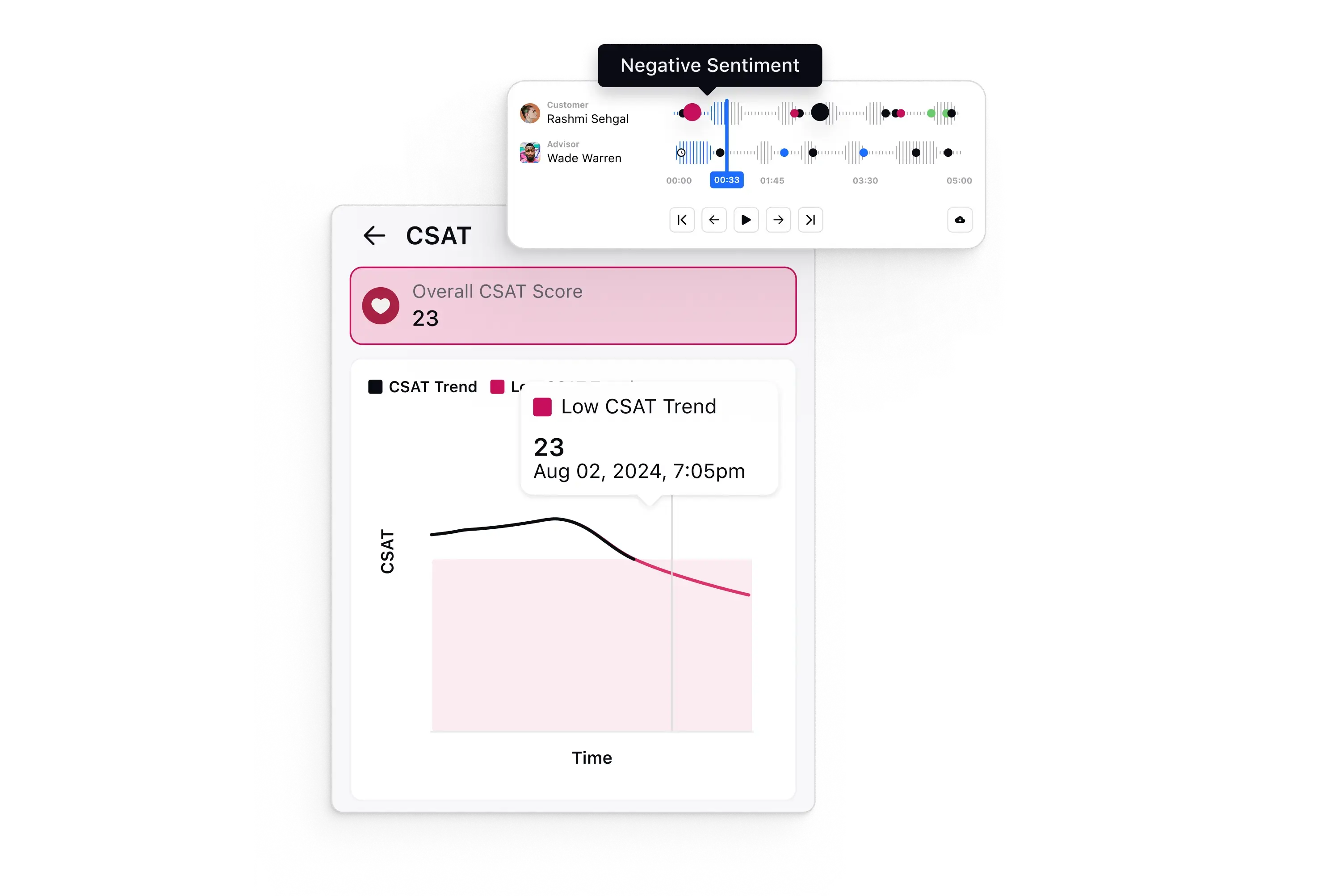
Modern conversational analytics software can take your CSAT tracking to the next level. They let you predict CSAT scores during live conversations and analyze real-time fluctuations as interactions unfold.
You can identify specific messages from the customer or the agent that trigger positive or negative shifts in CSAT, giving you precise insights into what drives customer satisfaction. Using these tools lets you catch issues early and course-correct in real time, ensuring every interaction adds value to the customer experience.
3. Customer effort score (CES)
The customer effort score measures how hard a customer had to work to get what they came for, whether that was resolving an issue, making a purchase or returning a product. The survey usually appears at a specific customer touchpoint and asks respondents to agree or disagree that the company made it easy to handle their request.
Formula: CES = average of all responses to "the company made it easy for me to handle my issue", typically on a 1 to 7 scale
What good looks like: Gartner research found that low-effort interactions produce an NPS 65 points higher than high-effort ones, a 94% repurchase rate against 4%, and 37% lower service costs through fewer repeat calls, escalations and channel switches, according to Gartner.
Where it misleads you: CES scores one interaction, so effort spread thinly across a journey never shows up. A customer can rate every individual step as easy and still have spent three weeks getting a single thing done.
4. Customer sentiment
Customer sentiment reads the emotional tone of what customers actually write rather than the number they select, drawing on support tickets, chat transcripts, reviews and social mentions. It matters because it covers everyone who said something rather than only the fraction who filled in a survey, which makes it the closest thing to a continuous read on how a brand is perceived. Social listening and voice of the customer programs are where most brands collect it.
Formula: Sentiment score = (positive mentions − negative mentions) ÷ total mentions analyzed
What good looks like: There is no meaningful cross-industry benchmark, because sentiment scoring depends entirely on the model and the channel mix behind it. What matters is the direction of the trend and whether a shift traces back to a specific product, policy or release.
Where it misleads you: Sarcasm, industry jargon and mixed messages in a single ticket all confuse sentiment models, so a score that moves sharply is worth reading back to source before anyone acts on it.
Operational KPIs: what your service function delivers
5. First contact resolution (FCR)
First contact resolution measures the share of customer issues settled during the first interaction, with no callback, transfer or follow-up needed. It correlates more tightly with satisfaction than any other operational metric, largely because a repeat contact costs the customer time they did not expect to spend.
Formula: FCR = (issues resolved on first contact ÷ total issues) × 100
What good looks like: SQM Group puts the contact center average at 71%, classifies 70–79% as good and sets world-class at 80% or above, a level roughly 5% of centers reach. Performance across its benchmark runs from about 40% to 91%, with retail averaging 77% and telco 56%.
Where it misleads you: How you measure it changes the answer. Internal measurement that counts any contact without a repeat inside a set window reports a materially higher number than a post-contact survey asking the customer whether the issue was truly settled, so comparing your internal figure against a survey-based benchmark flatters you.
6. First response time (FRT)
First response time measures the gap between a customer reaching out and a support agent replying for the first time. It sets the tone for everything that follows, because a customer waiting without acknowledgement assumes nothing is happening, and AI can compress that gap on the channels where waiting hurts most.
Formula: FRT = total time to first response across all conversations ÷ number of conversations
What good looks like: There is no defensible cross-industry number here, because expectations are set by channel rather than by sector. Live chat and messaging are judged in seconds and minutes while email is judged in hours, so segment the metric by channel and hold a separate target for each.
Where it misleads you: An automated acknowledgement counts as a first response in most systems and pulls the average down without anyone having read the message. Exclude auto-replies from the calculation or the number stops meaning anything.
7. Average resolution time (ART)
Average resolution time tracks how long it takes to fully settle a customer’s issue from the moment they first make contact. It is the metric most commonly written into service level agreements, and it climbs naturally as the easy cases get automated and only the complex ones reach a human.
Formula: ART = total time to resolve all cases ÷ number of resolved cases
What good looks like: Read it against your own baseline rather than an external figure, and always alongside first contact resolution. A resolution time that falls while FCR falls with it means cases are being closed rather than solved.
Where it misleads you: Whether the clock keeps running while a case waits on the customer changes the number enormously, and teams that pause the timer during customer waits are not measuring the same thing as teams that do not.
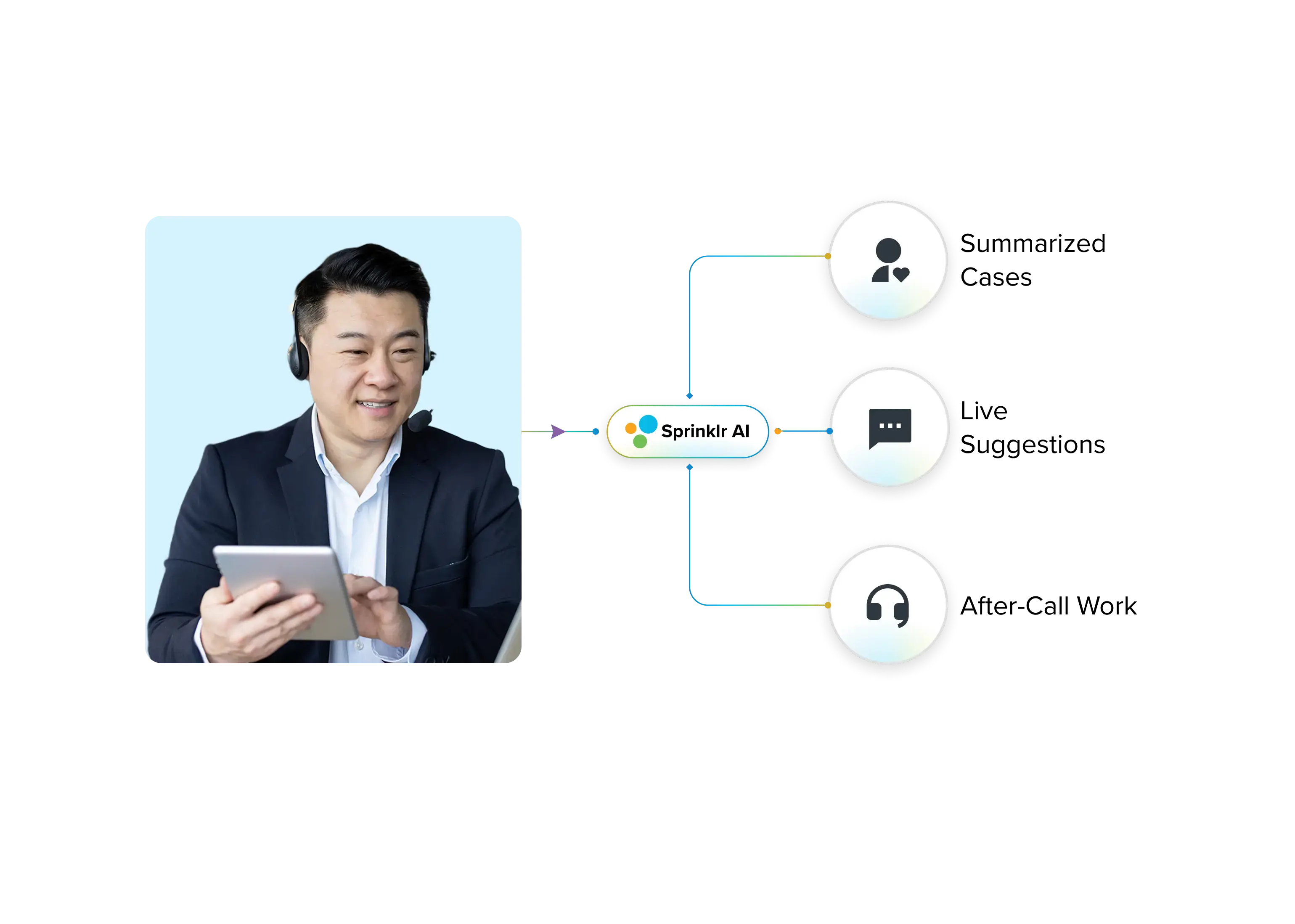
Ask an agent where their time actually goes and it's rarely the conversation itself. It's the summarizing and wrap-up that has to happen before the next case can even start. Sprinklr Copilot takes that off their plate. It summarizes the case so whoever picks it up next isn't rereading the whole thread, drafts replies, pulls up guided workflows mid-conversation and clears after-call work once the customer's gone.
8. AI resolution rate
AI resolution rate measures the share of conversations an AI agent handled from start to finish without a human stepping in and without the customer coming back about the same issue. As agentic AI takes on a larger share of inbound volume, this becomes the metric that determines whether automation is improving the experience or simply hiding demand from the people who could fix it.
Formula: AI resolution rate = (conversations resolved end to end by AI ÷ total conversations handled by AI) × 100
What good looks like: Published figures vary so widely that most of them are not comparable, because vendors measure different things under the same name. Set the target against your own pre-automation resolution rate for the same case types and track the reopen rate beside it.
Where it misleads you: A customer who abandons a frustrating chat without asking for a human counts as a success under most configurations. Pair the rate with reopen rate and with CSAT collected specifically on AI-handled conversations, or you will read silence as satisfaction.
Resolution, deflection and containment may not be the same thing
The three terms get used interchangeably in vendor material and they count very different things. Containment counts conversations that never reached a human, deflection counts contacts that never happened at all because the customer found an answer elsewhere, and resolution counts problems that were solved. A program can report 85% containment while its reopen rate climbs, which means customers are being held inside the automation rather than helped by it. When you compare your own numbers against anything published, the first question to settle is which of the three the other party was measuring.
Business-outcome KPIs: what the experience returns
9. Customer churn rate
Customer churn rate is the percentage of customers who stop using your product or service across a given period. It is the bluntest signal you have that something in the experience is not working, and because it arrives after the fact, it is only useful when paired with something that predicts it. Retention management is where the response to a rising churn rate actually gets built.
Formula: Churn rate = (customers lost during the period ÷ customers at the start of the period) × 100
What good looks like: Benchmarks depend so heavily on contract length and business model that a cross-industry figure is close to useless. What is worth comparing is your voluntary churn against your involuntary churn, since failed payments and expired cards are a different problem from dissatisfaction.
Where it misleads you: A headline churn rate hides which customers left. Losing 5% of your smallest accounts and losing 5% of your largest are the same number and completely different events, which is why churn should always be segmented by revenue before anyone reacts to it.
10. Customer retention rate
Customer retention rate is the inverse of churn and measures the share of customers you kept across a period, excluding anyone you newly acquired inside it. Keeping the two side by side matters because they behave differently under growth: rapid acquisition can flatter retention while churn quietly worsens in the existing base. Sprinklr covers how to calculate it and the strategies that move it in more depth.
Formula: Retention rate = ((customers at end of period − new customers acquired during period) ÷ customers at start of period) × 100
What good looks like: Segment it before you benchmark it. Retention by cohort, by tier and by region tells you where the experience is holding and where it is not, whereas a single company-wide figure mostly tells you how your largest segment behaved.
Where it misleads you: Retention counts customers who have not left, not customers who are happy. An account locked into a multi-year contract retains perfectly right up to the renewal conversation, so retention needs a perception metric alongside it to have any predictive value.
11. Customer lifetime value (CLV)
Customer lifetime value forecasts the total revenue you can reasonably expect from one customer across the whole relationship. It is the number that decides how much you can justify spending to acquire and keep somebody, and focusing on high-CLV segments is how most teams work out where service investment actually pays back.
Formula: CLV = average purchase value × average purchase frequency × average customer lifespan
What good looks like: Compare it against customer acquisition cost rather than against another company. A CLV to CAC relationship that is narrowing tells you something urgent, whereas a CLV figure on its own tells you almost nothing.
Where it misleads you: Historical CLV describes customers who already behaved a certain way, which makes it a poor guide during any period when pricing, packaging or the product itself has changed. Predicted CLV is more useful and considerably easier to get wrong.
12. Customer referral rate
Customer referral rate measures the share of customers who actively recommended you to somebody who then became a customer themselves. It is the behavioral counterpart to NPS, which captures stated intent, and the gap between the two is usually the most interesting thing about either number. Referral behavior tends to follow sustained customer engagement rather than any single good interaction.
Formula: Referral rate = (customers acquired through referral ÷ total customers acquired) × 100
What good looks like: Read it against your stated NPS. A high NPS with a low referral rate means people are willing to recommend you, but nothing in the experience ever asks them to.
Where it misleads you: Attribution is the weak point. Referrals that arrive through word of mouth rather than a tracked referral link get recorded as direct or organic traffic, so the measured rate is almost always lower than the real one.
How to choose which customer experience KPIs to track
The instinct when you have twelve options is to track all of them, and the result is a dashboard nobody opens. A workable scorecard takes one relationship metric, one interaction metric, two operational guardrails and one business outcome, which gives you five numbers that, between them, explain what customers feel, what your team delivered and what it earned.
Which five depends on where the customer experience is getting tracked. Teams setting up measurement for the first time are usually better served by CSAT and first response time, because both move quickly enough to show whether a change worked. Programs that already have a baseline gain more from adding customer effort score and first contact resolution, since those two explain why satisfaction is where it is. Mature programs are where sentiment and AI resolution rate start to pay off, because they need enough interaction volume and enough historical context to be readable at all. Whichever set you land on, tie each KPI to a named owner and a threshold that triggers something, because a metric with no consequence attached will drift for quarters before anyone notices.
It is also worth deciding in advance which pairs you will read together, since almost every failure mode in this list comes from reading one number alone. Resolution time belongs next to first contact resolution, retention belongs next to a perception metric, and AI resolution rate belongs next to reopen rate. Sprinklr’s guides to customer experience metrics and customer experience analytics go further into how those pairings work in practice.
Drill into details and act fast with Sprinklr
Tracking customer experience KPIs is essential for understanding how well your business meets customer expectations. But here's the challenge: Even with the right KPIs, it can be difficult to act quickly on the insights they provide. Your team is likely juggling multiple tools, scattered data and siloed processes, making it harder to respond to customer needs in real time.
This is where the real opportunity lies — using AI to streamline and unify your customer service operations.
Sprinklr Service, built on the world's only Unified-CXM platform, enables your team to act faster and smarter. By integrating CX insights directly into a unified platform, Sprinklr ensures you can impeccably track KPIs like CSAT, NPS, FCR and others discussed above and proactively improve them. With real-time AI suggestions, predictive analytics and a single customer view, your agents can resolve issues efficiently, leading to happier customers.
The KPIs in this list only change anything when the person who can act on a number sees it without having to go looking, which is the case for putting measurement inside the workflow rather than in a weekly report. Contact center analytics software and omnichannel surveys software are where that collection and routing happens on the Sprinklr side.
Frequently Asked Questions
The most critical KPIs include net promoter score (NPS), customer satisfaction (CSAT), first response time (FRT), customer lifetime value (CLV) and churn rate. These metrics help gauge overall satisfaction, loyalty and the effectiveness of customer support.
KPIs can vary widely. For instance, e-commerce may focus more on KPIs like customer effort score, while service industries prioritize first response time and customer satisfaction. The choice of KPIs depends on what is most relevant to the customer experience in each sector or model.
Businesses can align KPIs with objectives by selecting metrics that directly reflect their strategic goals, such as improving customer retention or increasing sales. Regularly reviewing and adjusting KPIs ensures they remain relevant in an evolving business landscape.
Most organizations end up combining three types of tool: a survey platform to collect NPS, CSAT and CES at defined touchpoints, a contact center or service platform that generates response and resolution data as a by-product of the work, and an analytics layer that reads unstructured feedback from tickets, reviews and social channels. The practical constraint is not capability but consolidation, since KPIs held in separate systems cannot be read against each other, which is the point at which most measurement programs stall.
SQM Group puts the contact center industry average at 71%, treats 70–79% as a good rate and sets world-class at 80% or above, a level only about 5% of centers reach. Its benchmark spans roughly 40% to 91%, with retail averaging 77% and telco 56%, so the industry you operate in matters more than the headline figure, per SQM Group.
SQM Group’s research places the contact center average at 78%, with 75–84% considered good and 85% or higher considered world-class. For a wider reference point, the American Customer Satisfaction Index scored US customer satisfaction at 76.7 on a 100-point scale in the first quarter of 2026, according to ACSI.
Five is a workable number for most teams: one relationship metric such as NPS, one interaction metric such as CSAT or CES, two operational guardrails such as first contact resolution and first response time, and one business outcome such as churn or retention rate. Tracking more than that tends to dilute ownership rather than improve visibility.
Containment counts conversations that never reached a human agent. Resolution counts conversations where the customer’s problem was actually solved. The two diverge whenever a customer abandons an automated conversation in frustration, which registers as containment but not as resolution, so a containment rate rising alongside a rising reopen rate is a warning rather than a result.
Customer effort score tends to be the strongest early signal, because effort accumulates before dissatisfaction is ever expressed. Gartner research found that low-effort interactions produced a 94% repurchase rate against 4% for high-effort ones, according to Gartner. Reading CES alongside repeat contact rate gives you a usable churn warning weeks before a survey-cycle metric like NPS moves.
Aksheeta Tyagi is an experienced content marketer specializing in customer service, customer experience, contact center technology and AI-powered customer support. She writes in-depth guides on customer feedback management, conversational AI, agentic AI and enterprise service transformation to help businesses deliver better customer experiences at scale.